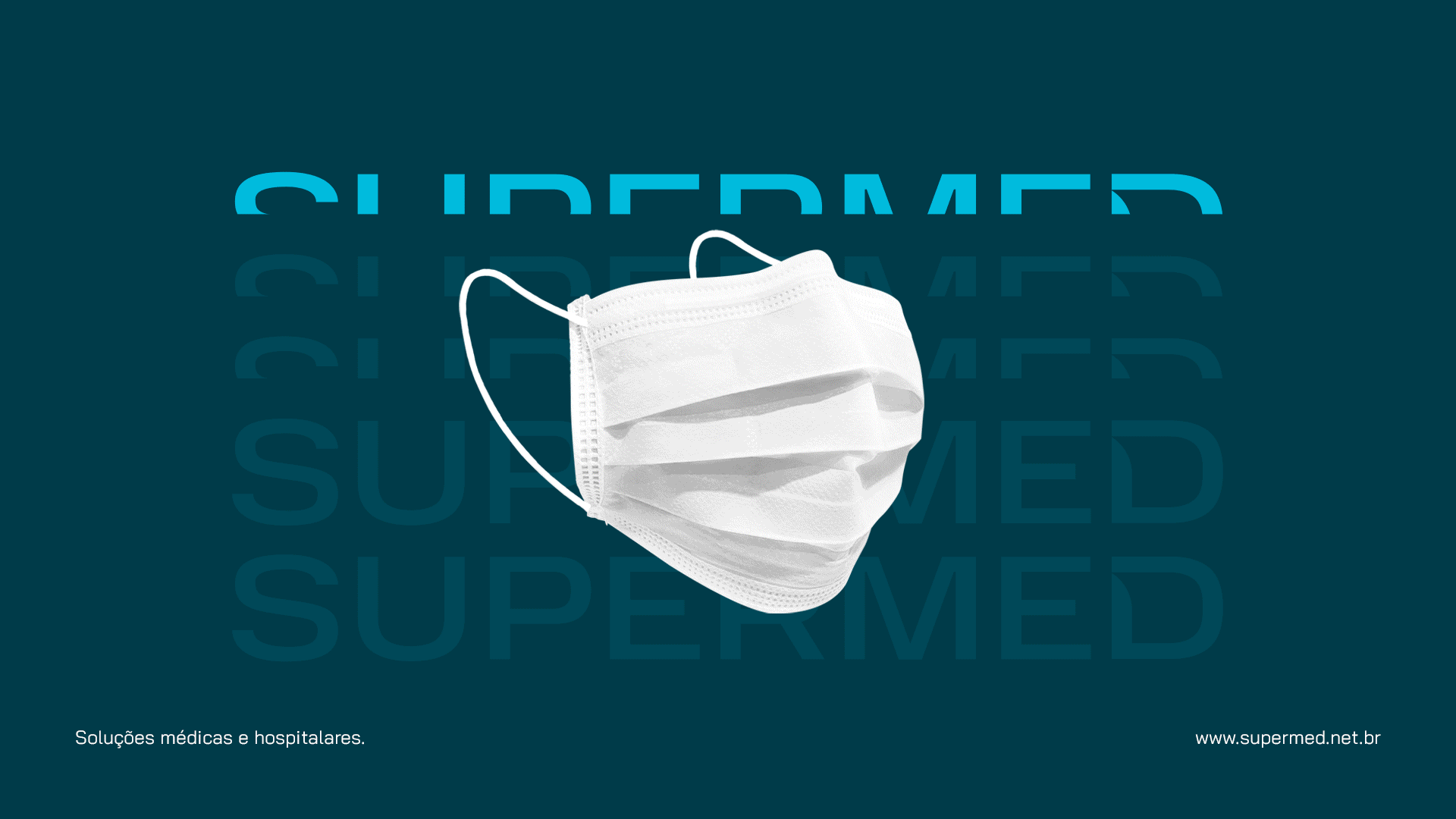
SUPERMED
Client: Supermed
Project: Brand strategy and positioning; visual and verbal identities and motion design.
Location: São Paulo, Brazil.
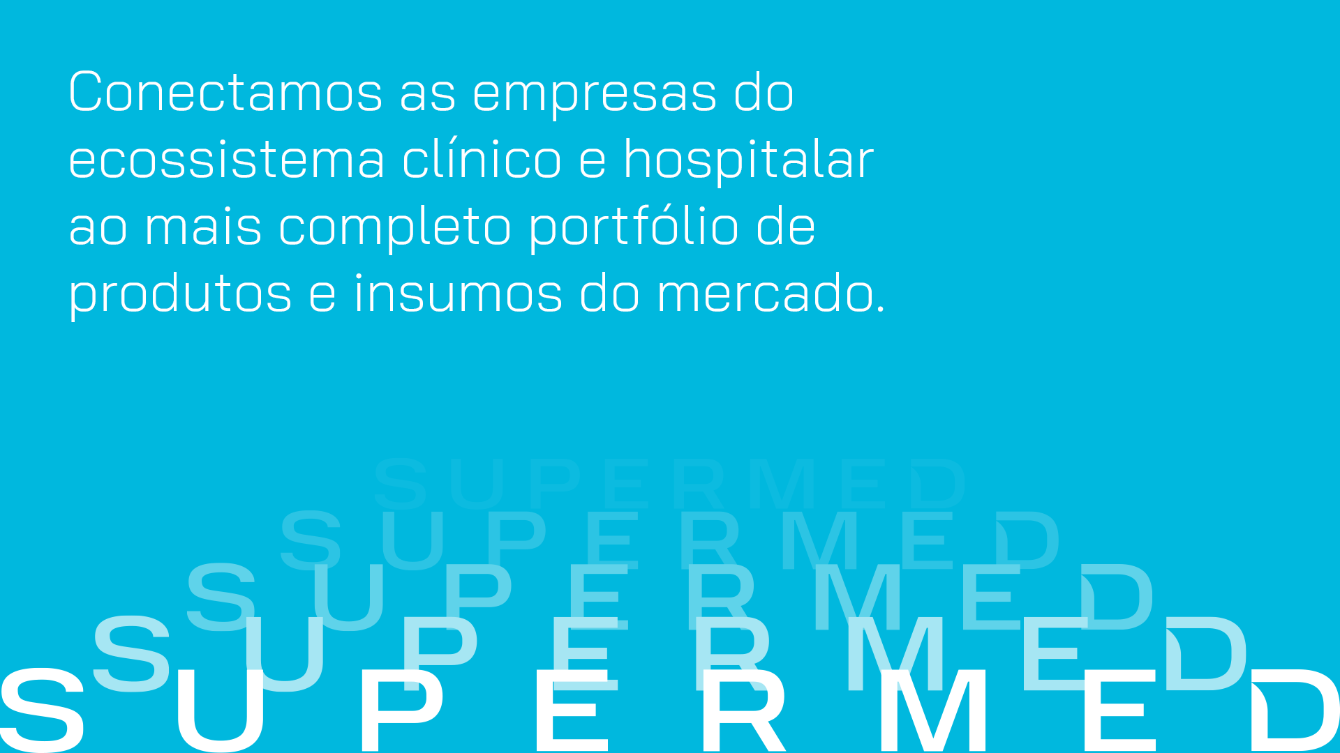
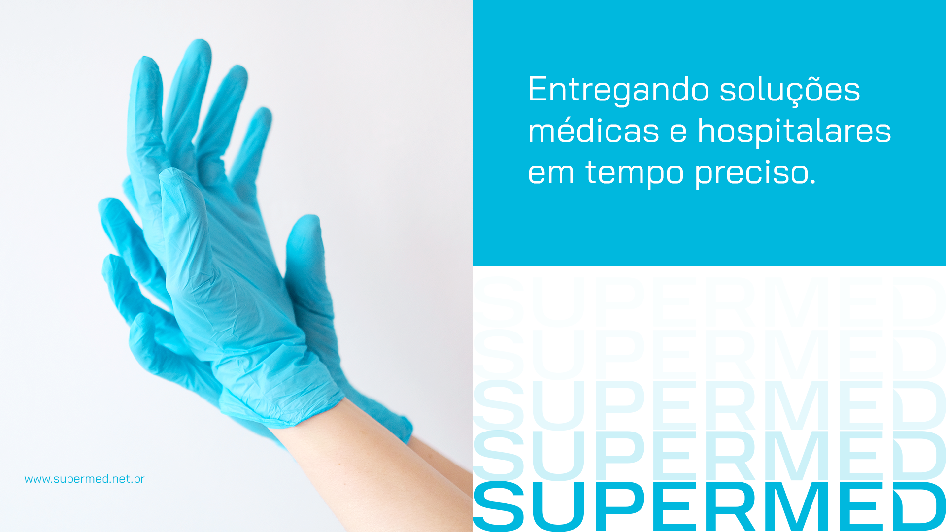
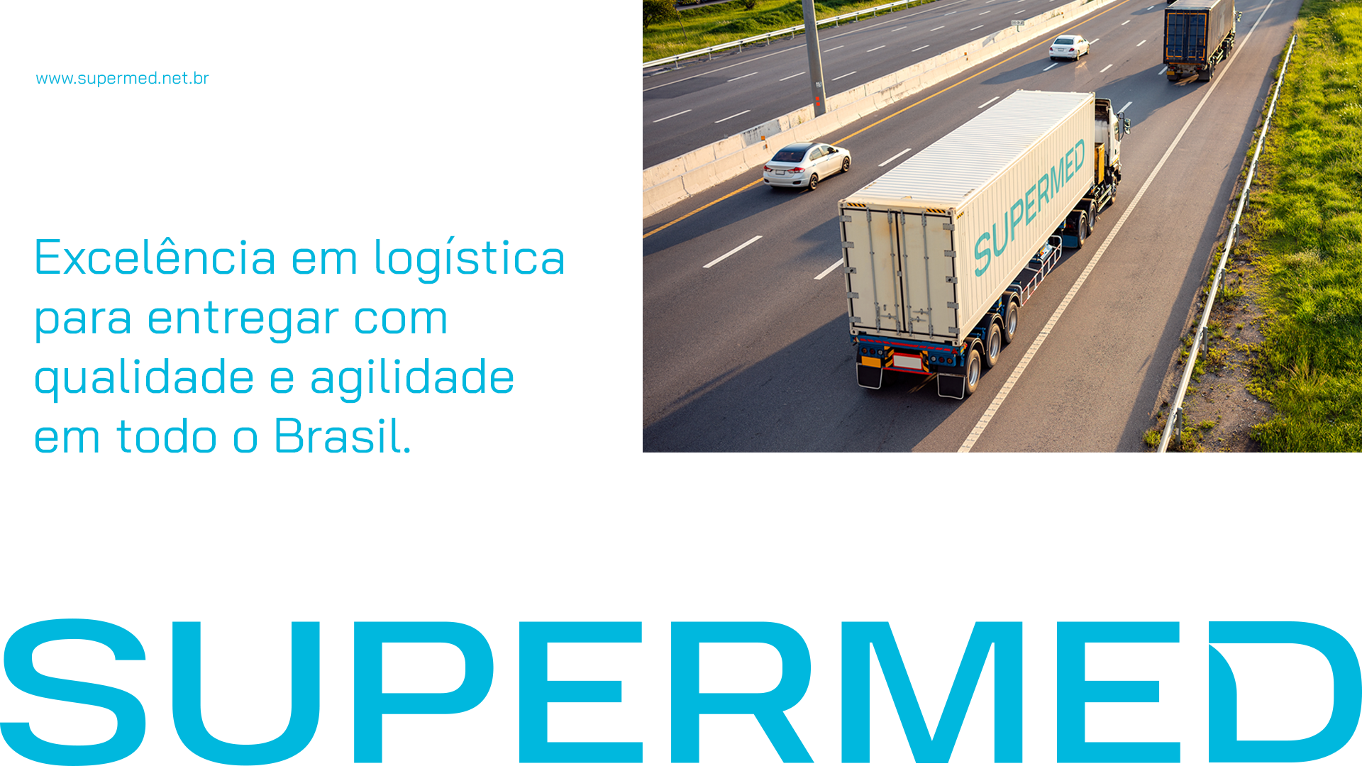
With more than 12 years in the market and around 500 employees, Supermed is one of the main distributors of medical and hospital products in Brazil. The company talks with the entire medical and hospital ecosystem, providing an extensive portfolio of high quality products for hospitals, clinics, offices, veterinary clinics and others.
CHALLENGE
The company saw the need to demonstrate to the market this growth and maturity over time, updating its positioning so that it was in line with its current moment, while maintaining its essence, but showing that it is constantly evolving. This positioning was reflected in a new brand identity, updating its image to increase the perception of business value and generate more credibility with market peers.
SOLUTION
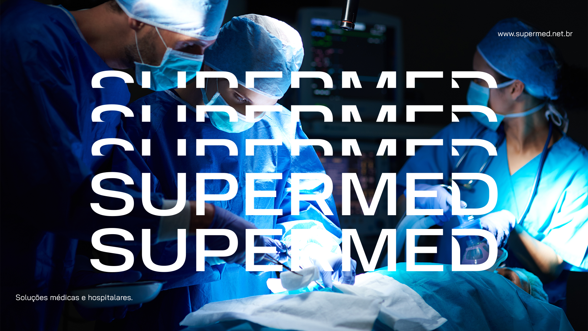
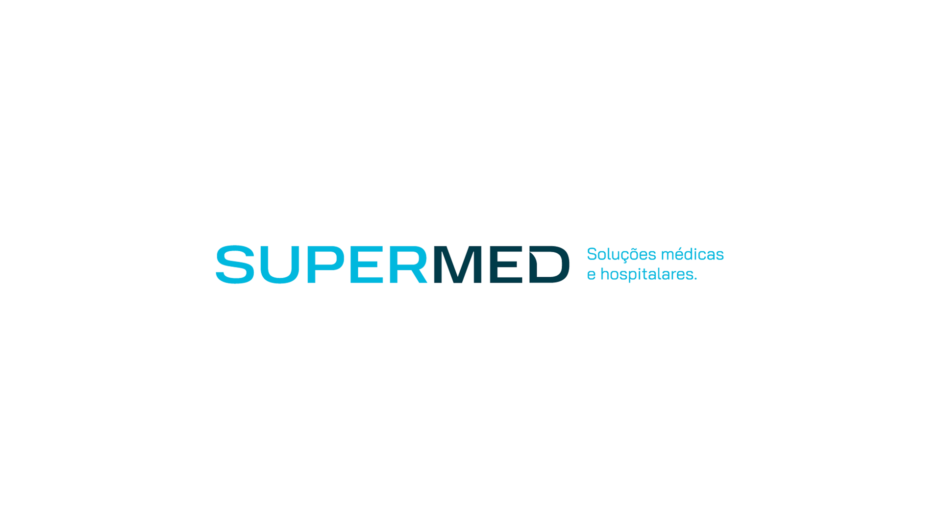
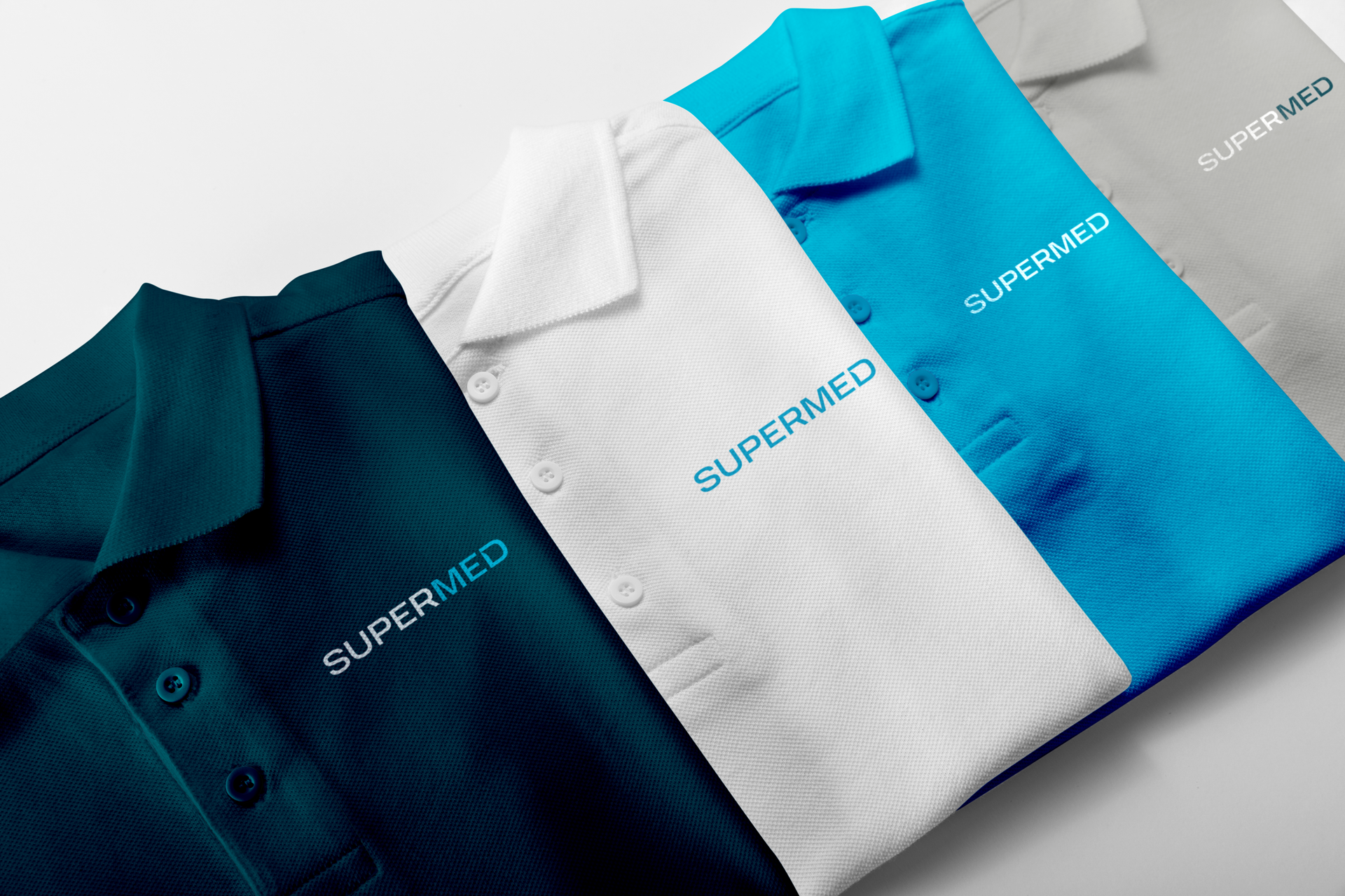
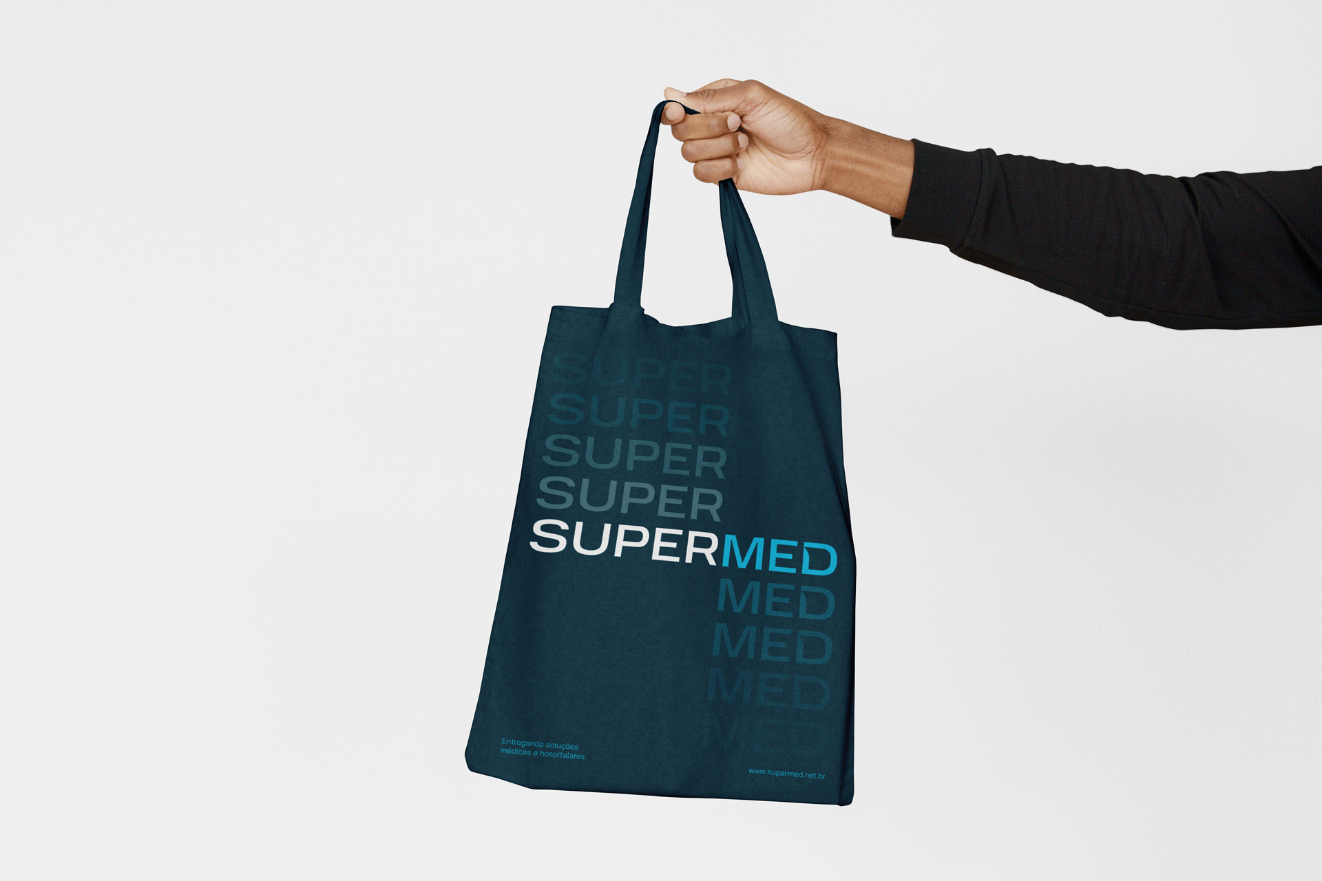
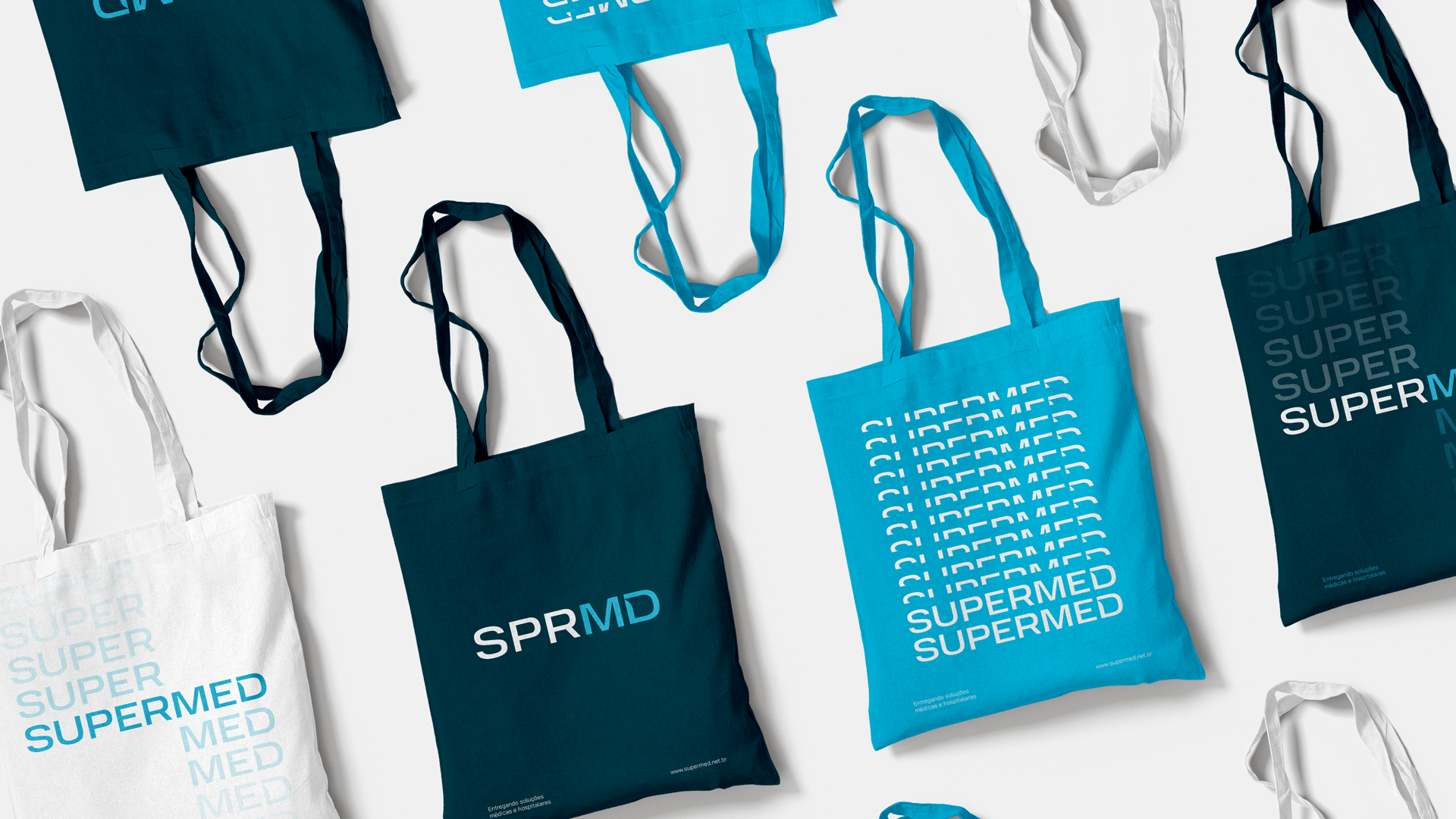
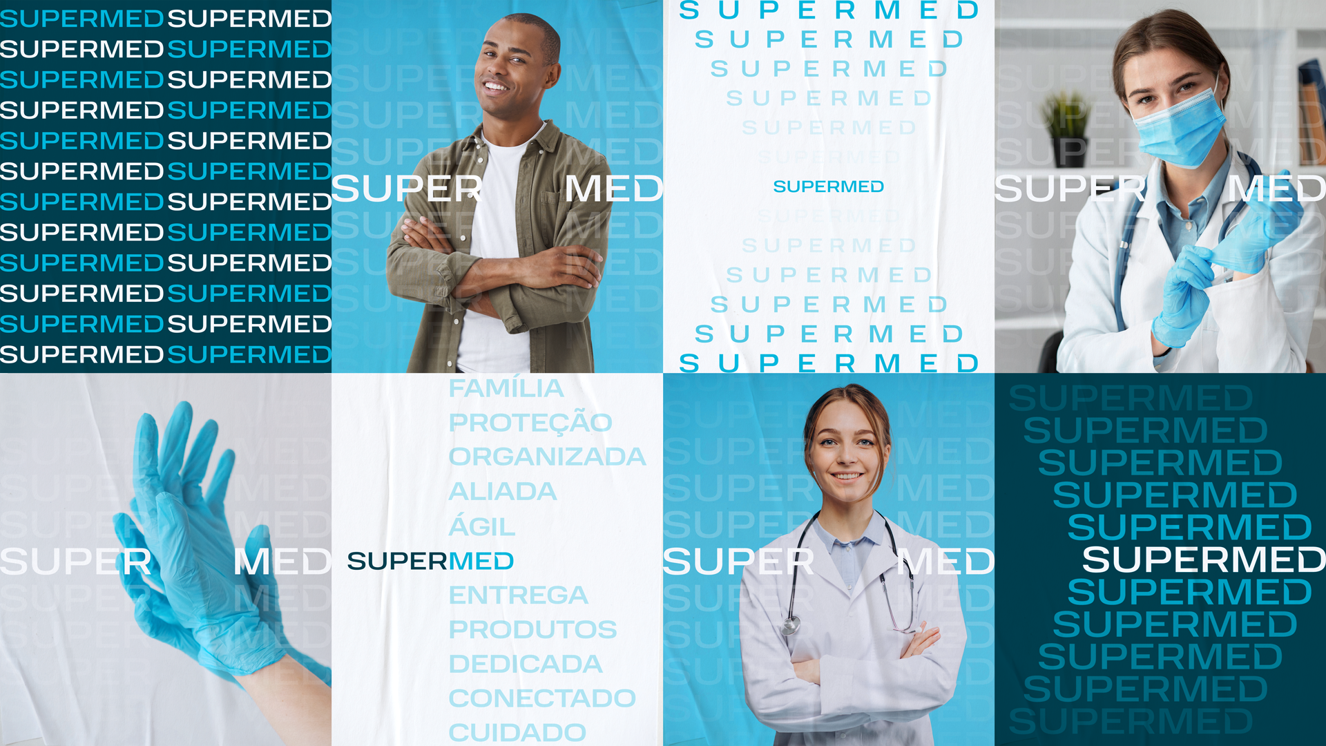
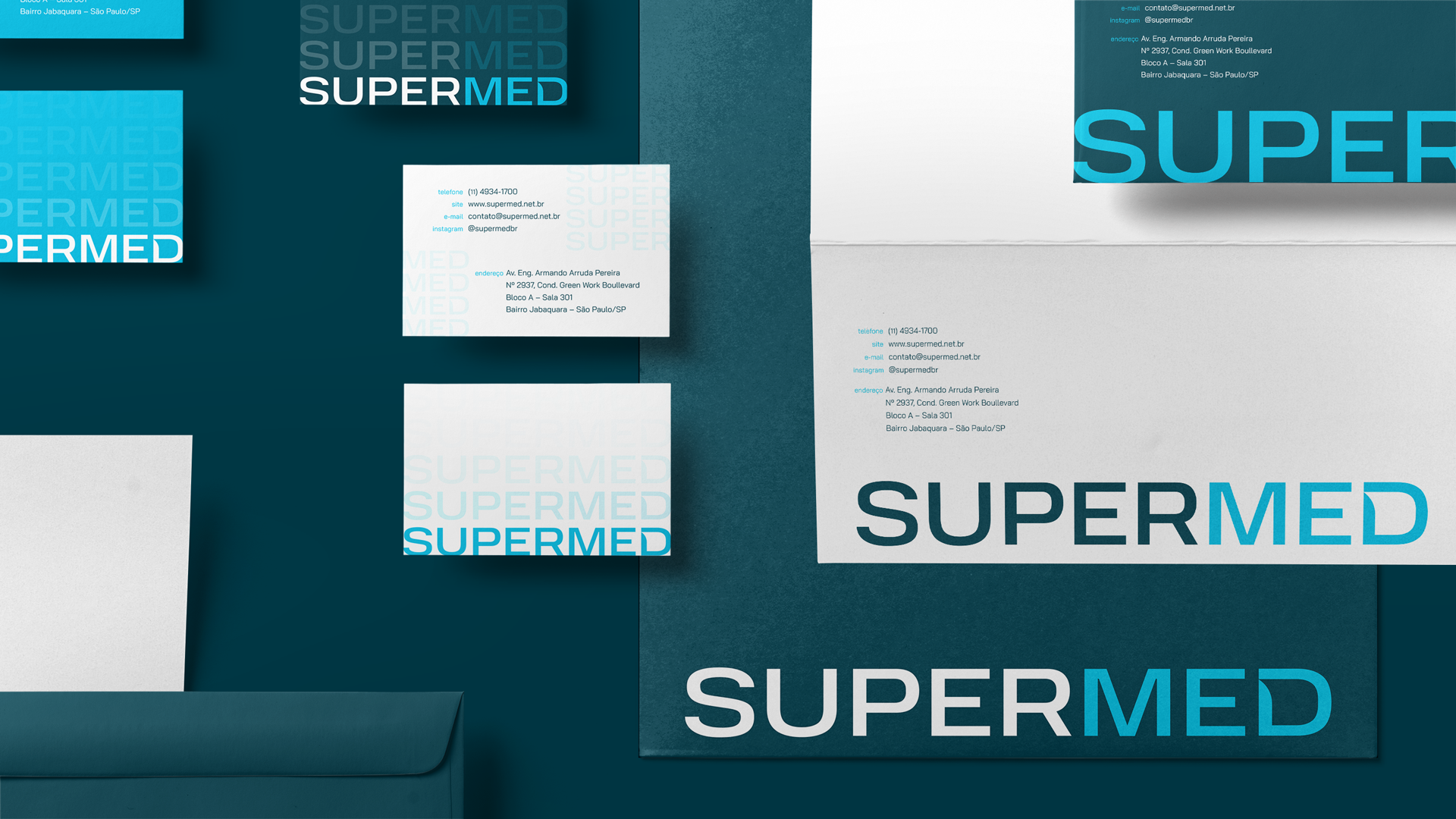
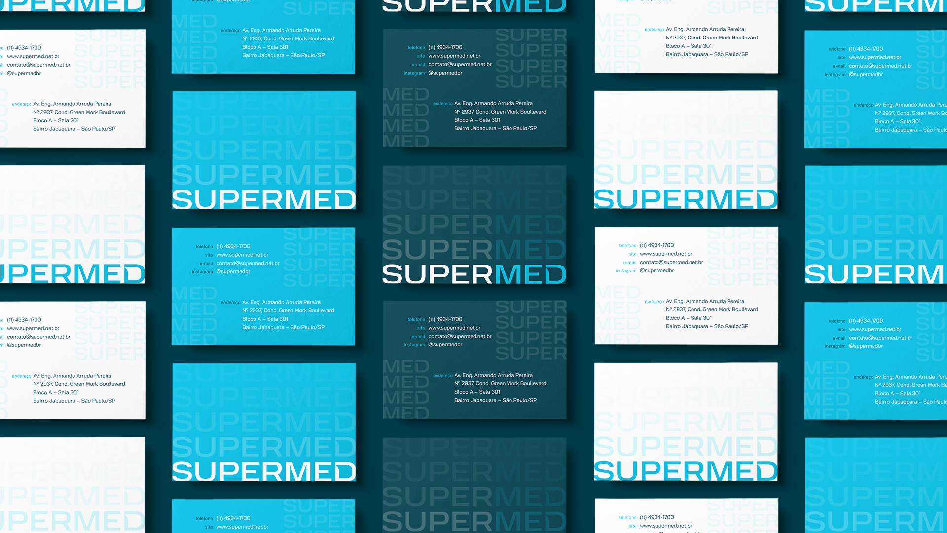
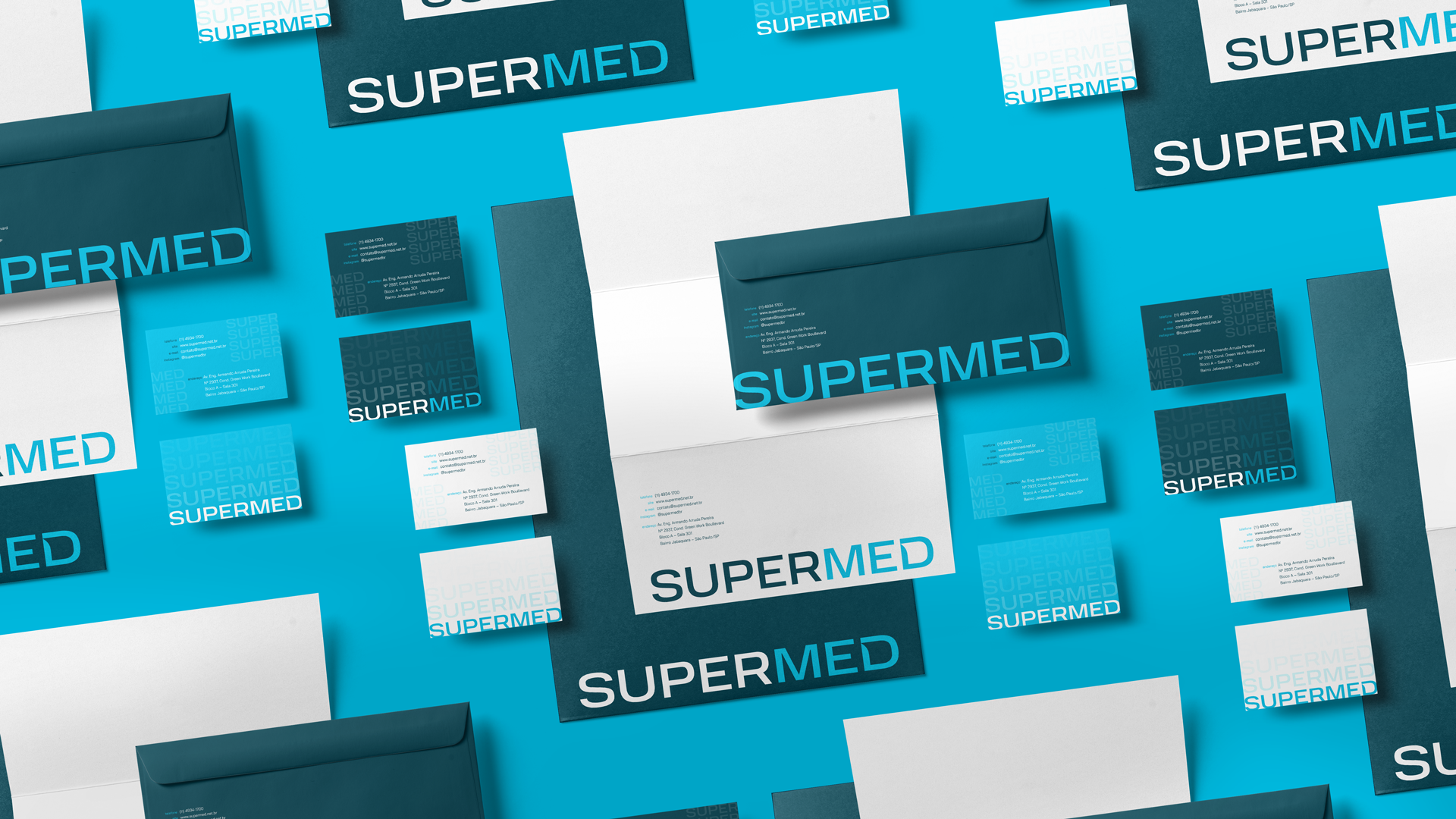
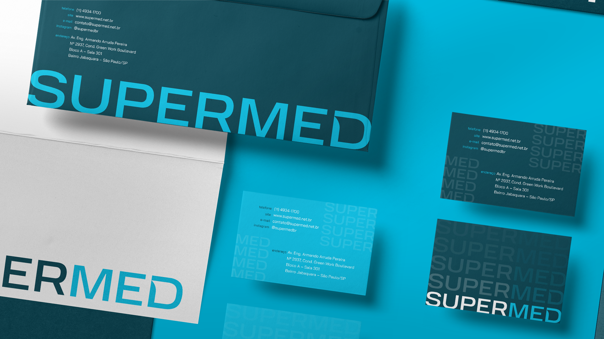
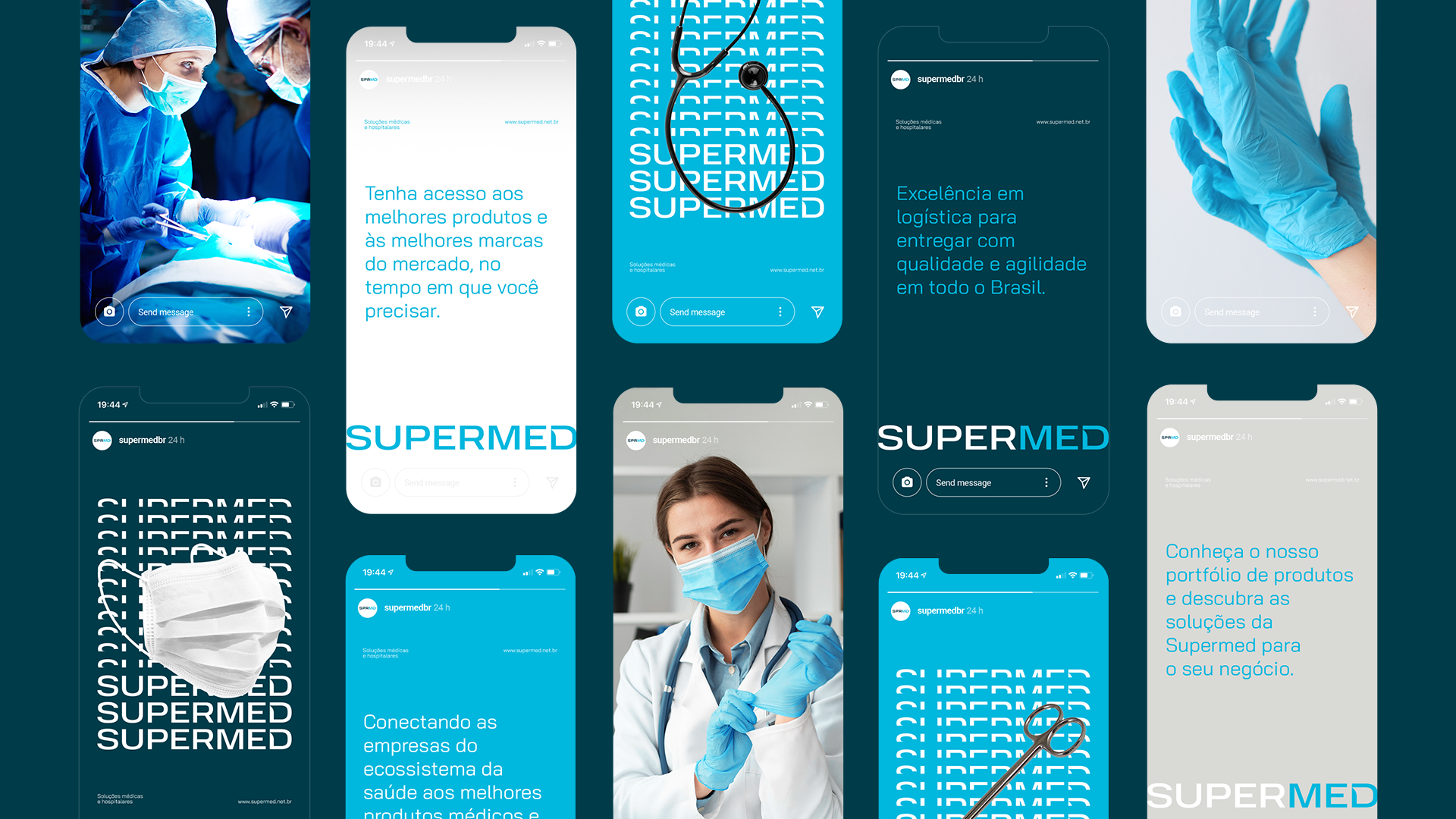
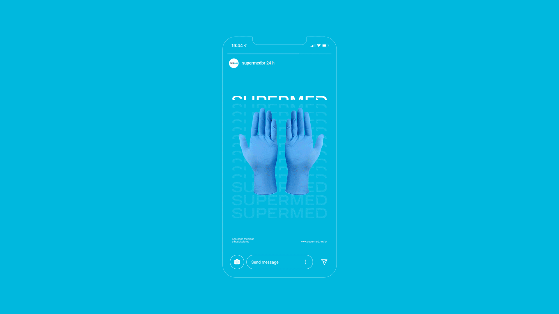
Supermed values its (super) delivery a lot - the search to go beyond for the customer and do more than expected. Connection, Movement and Clarity are the three pillars that support the company and were the foundations for conceptualizing the brand's rebranding.
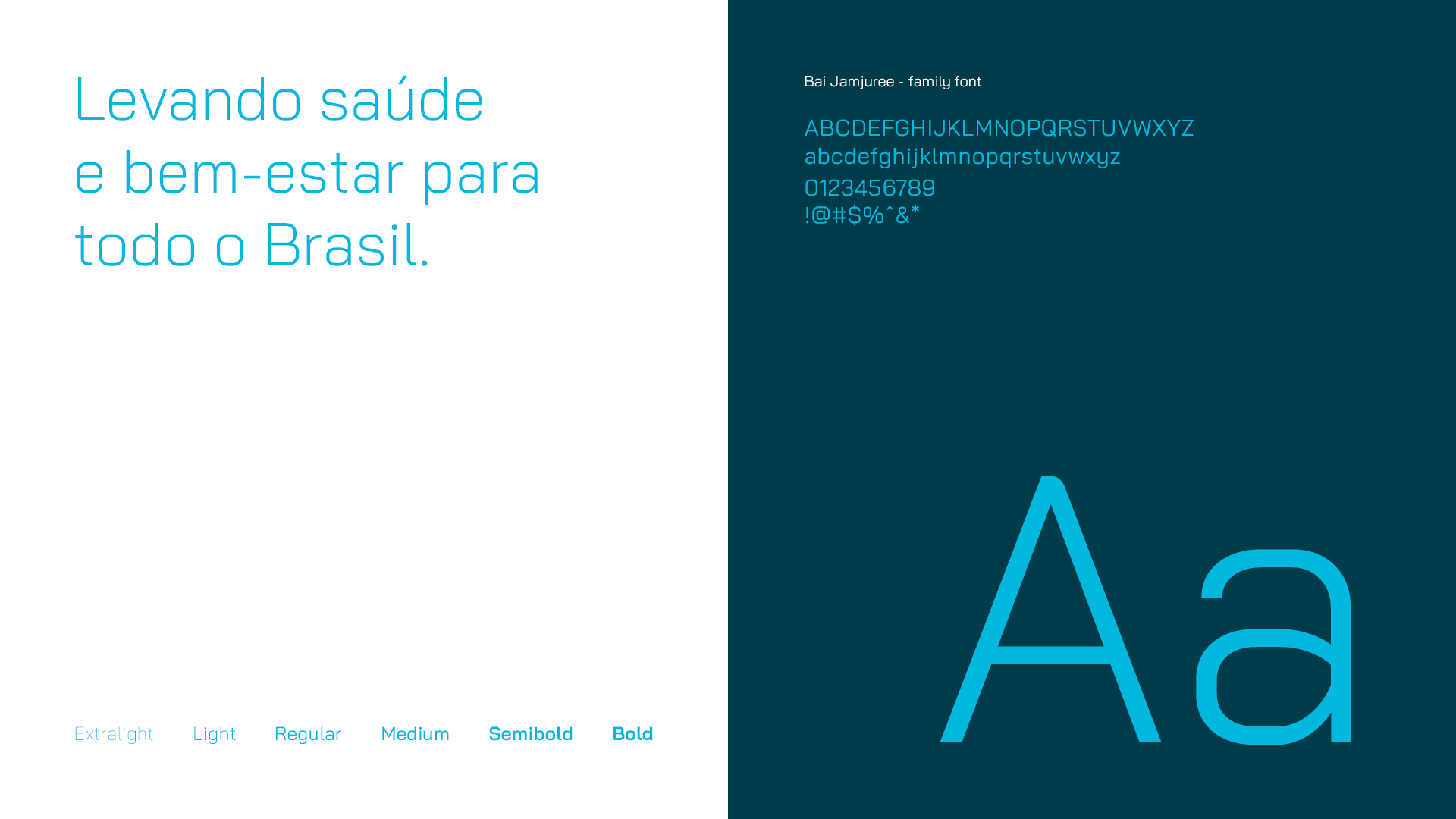
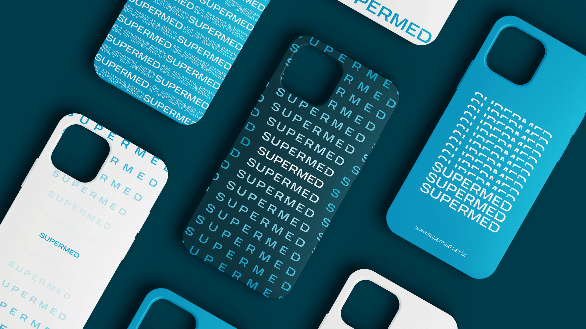
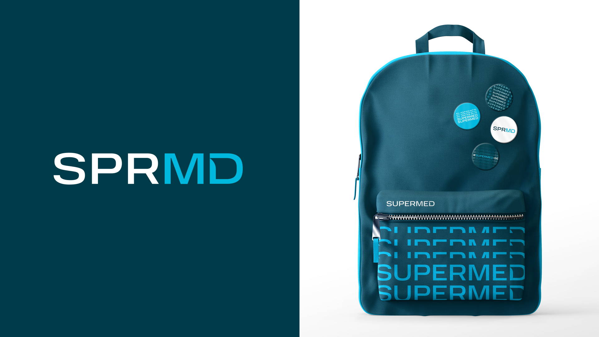
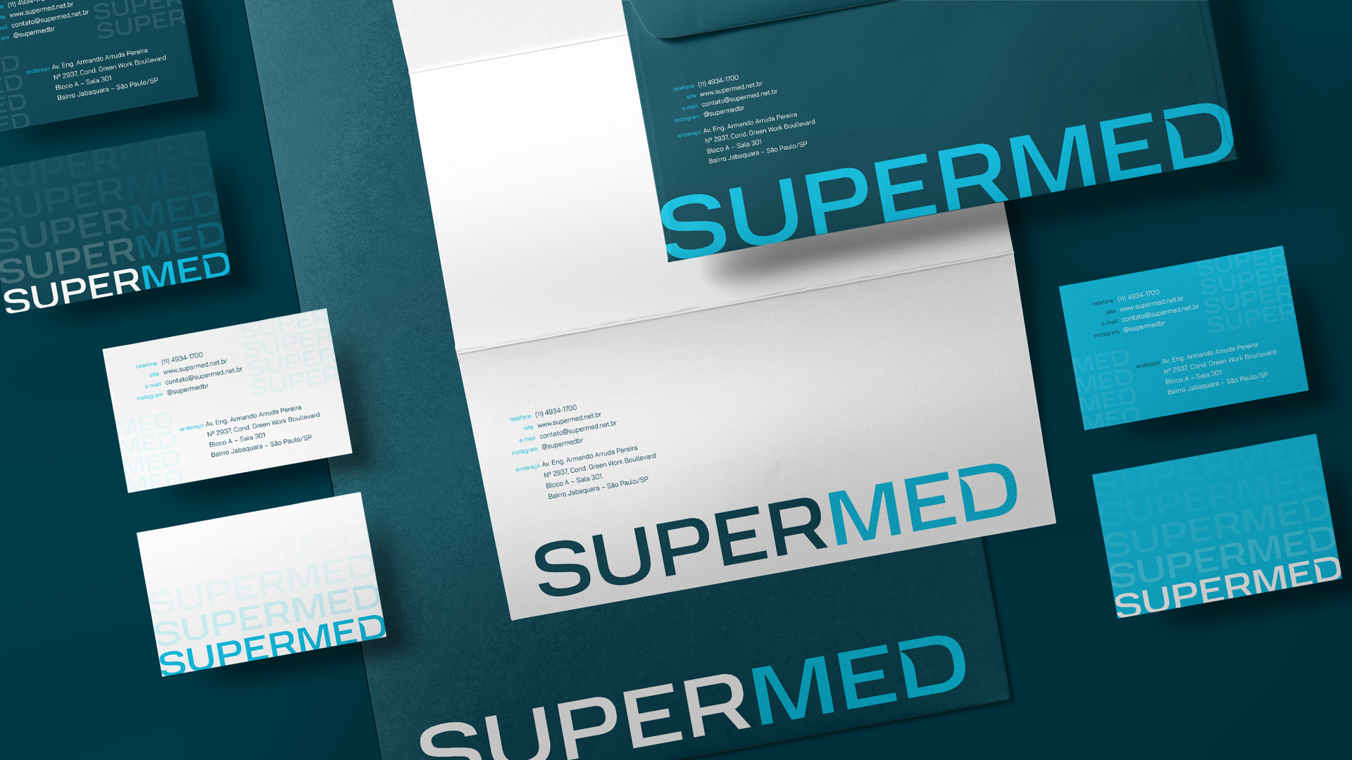
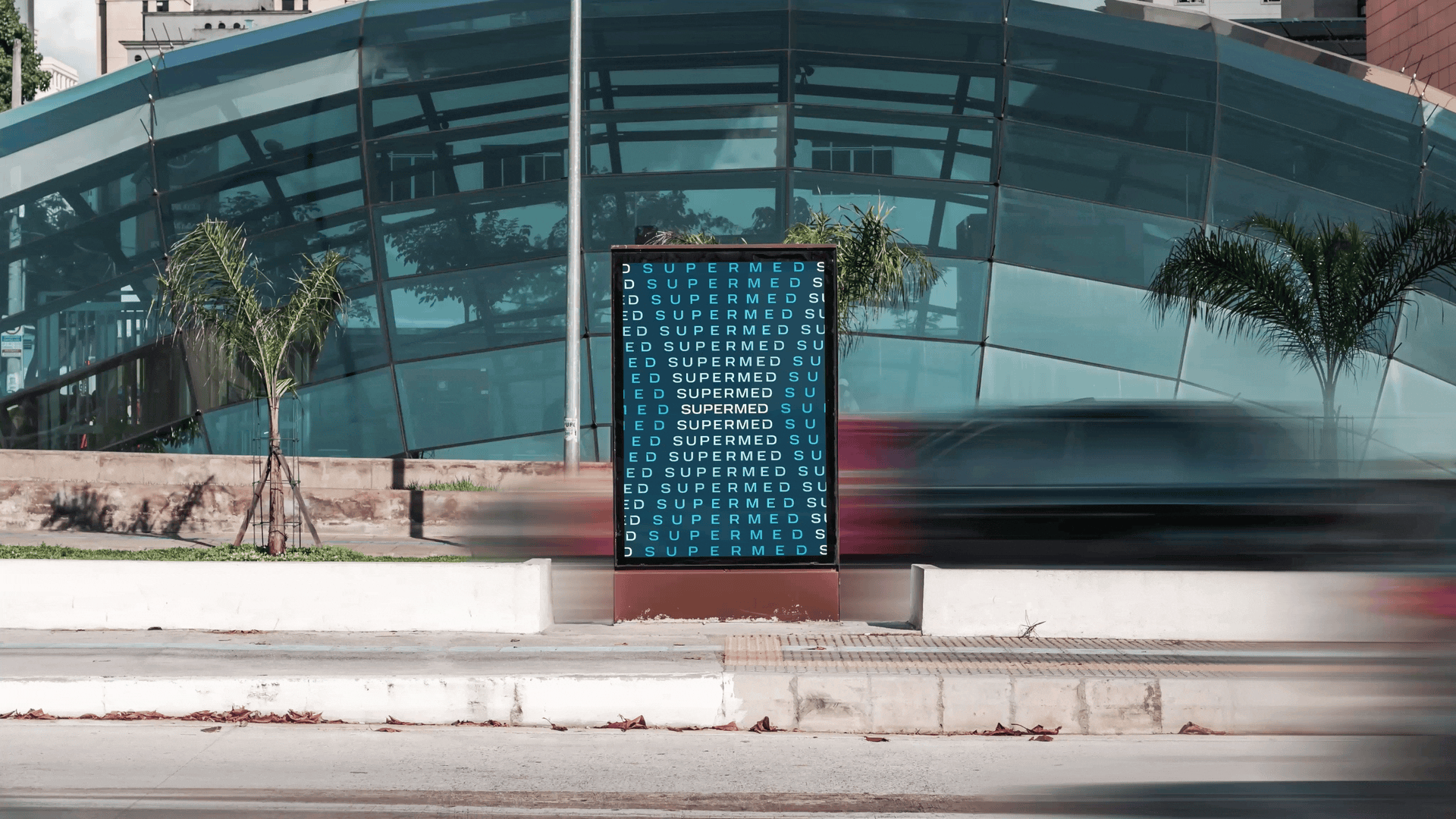
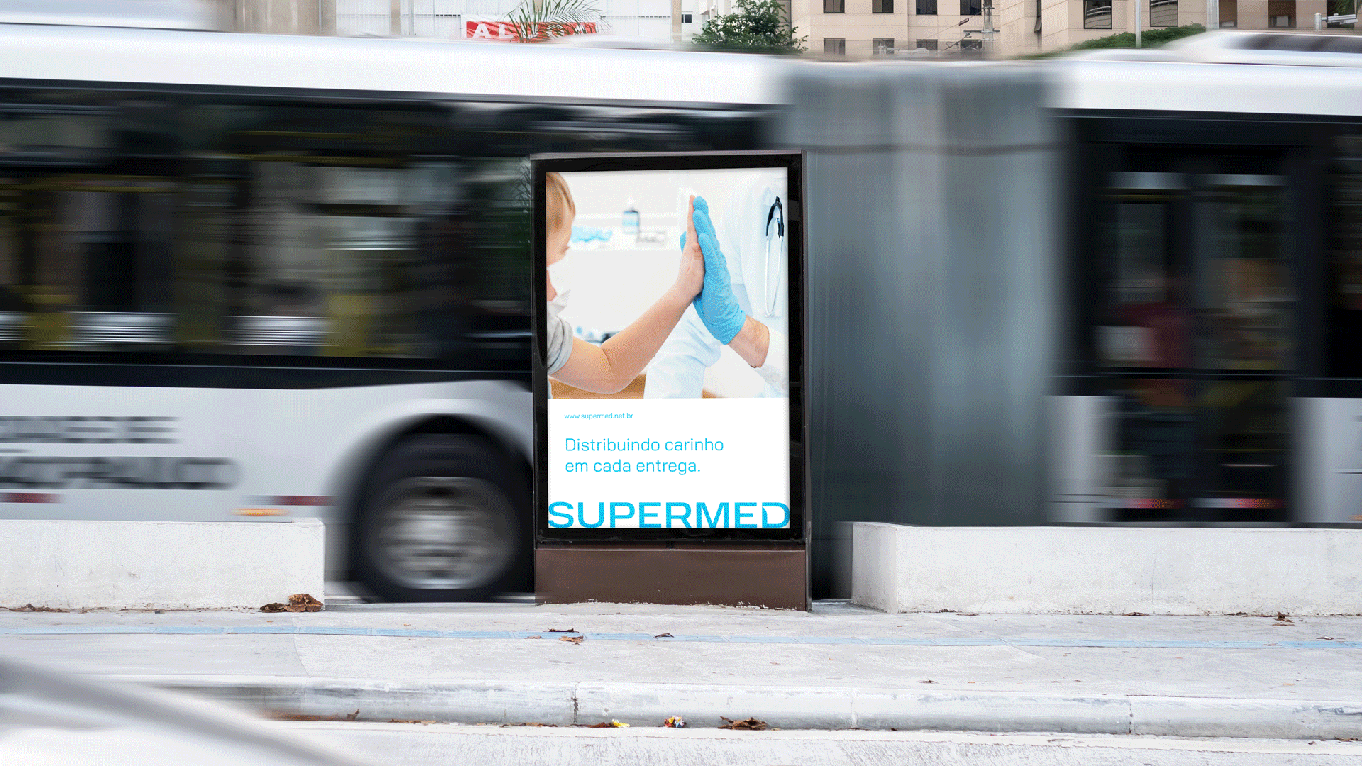
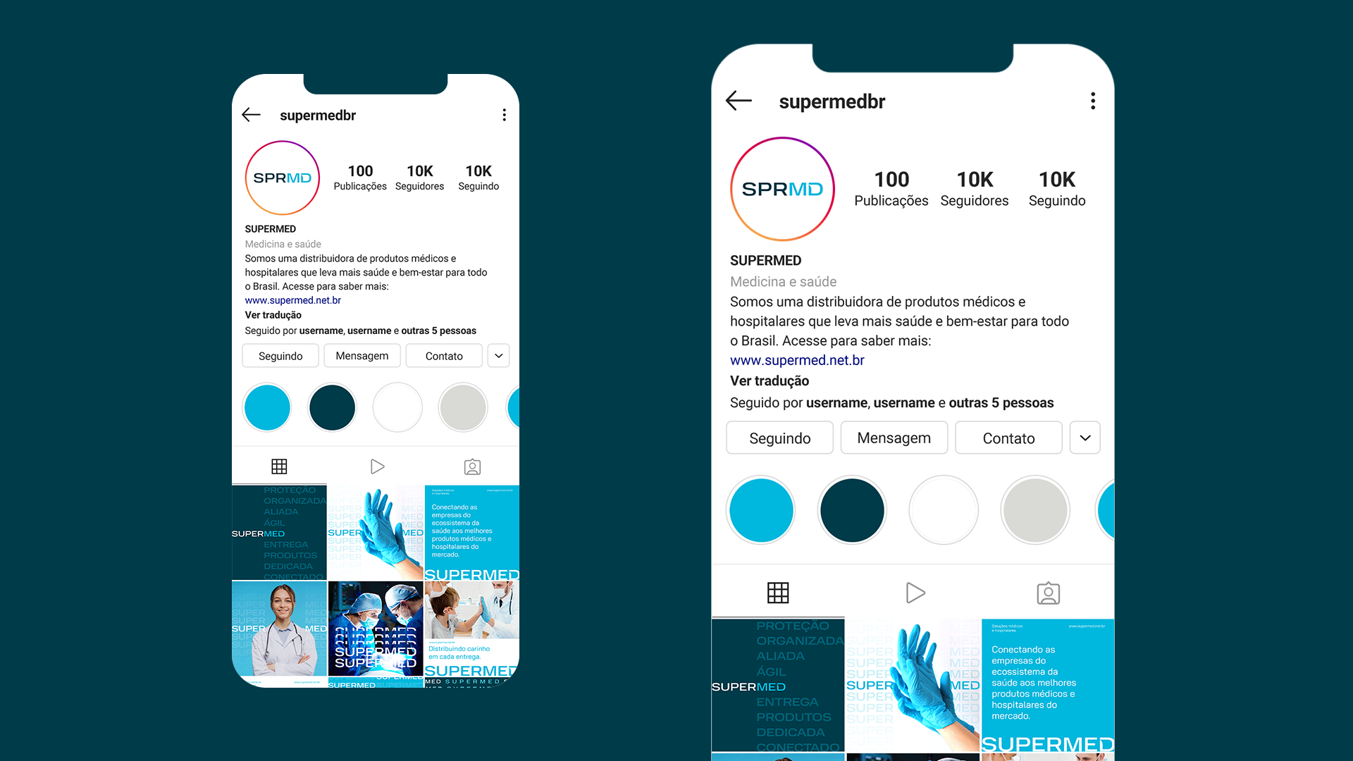
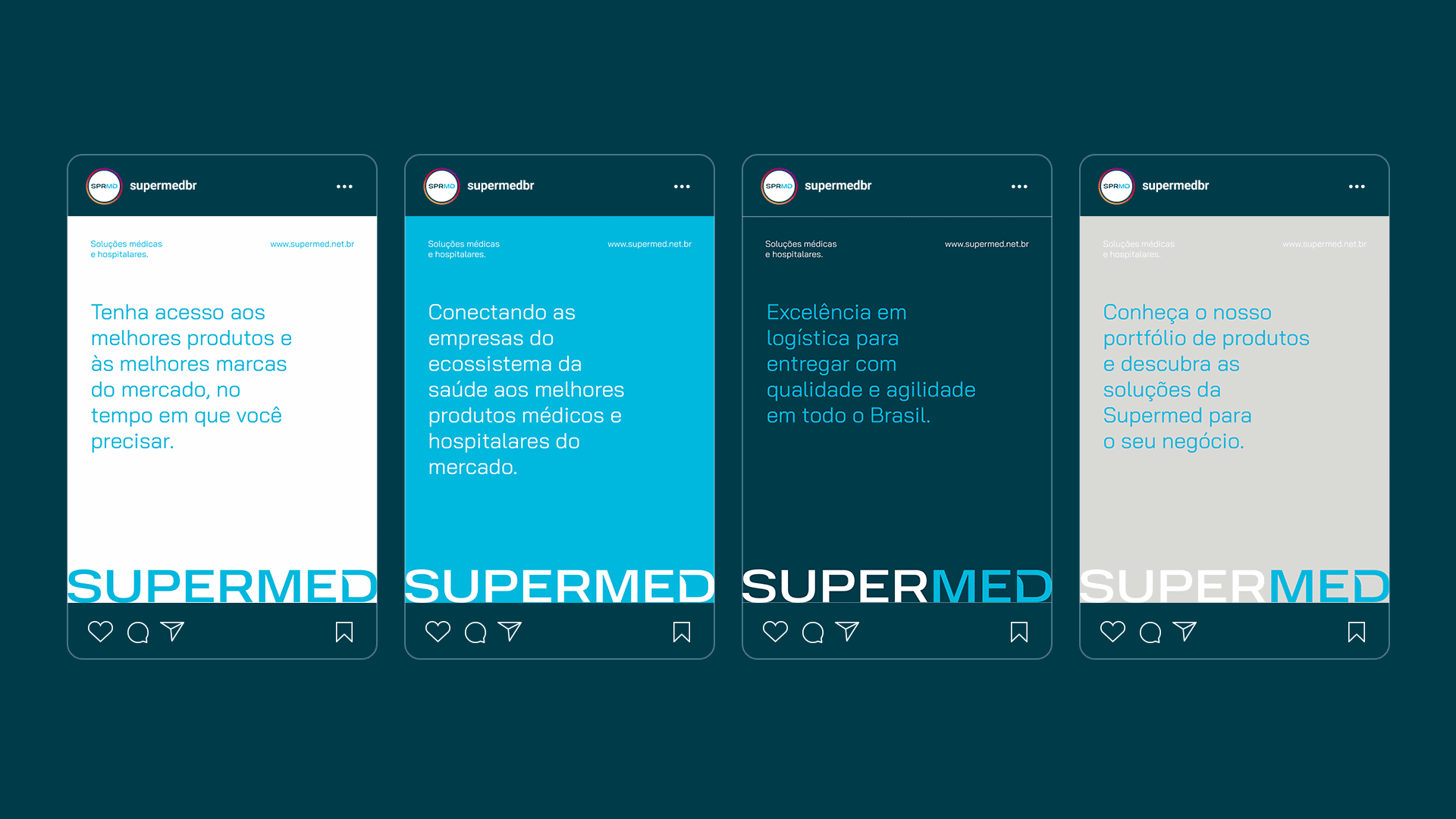
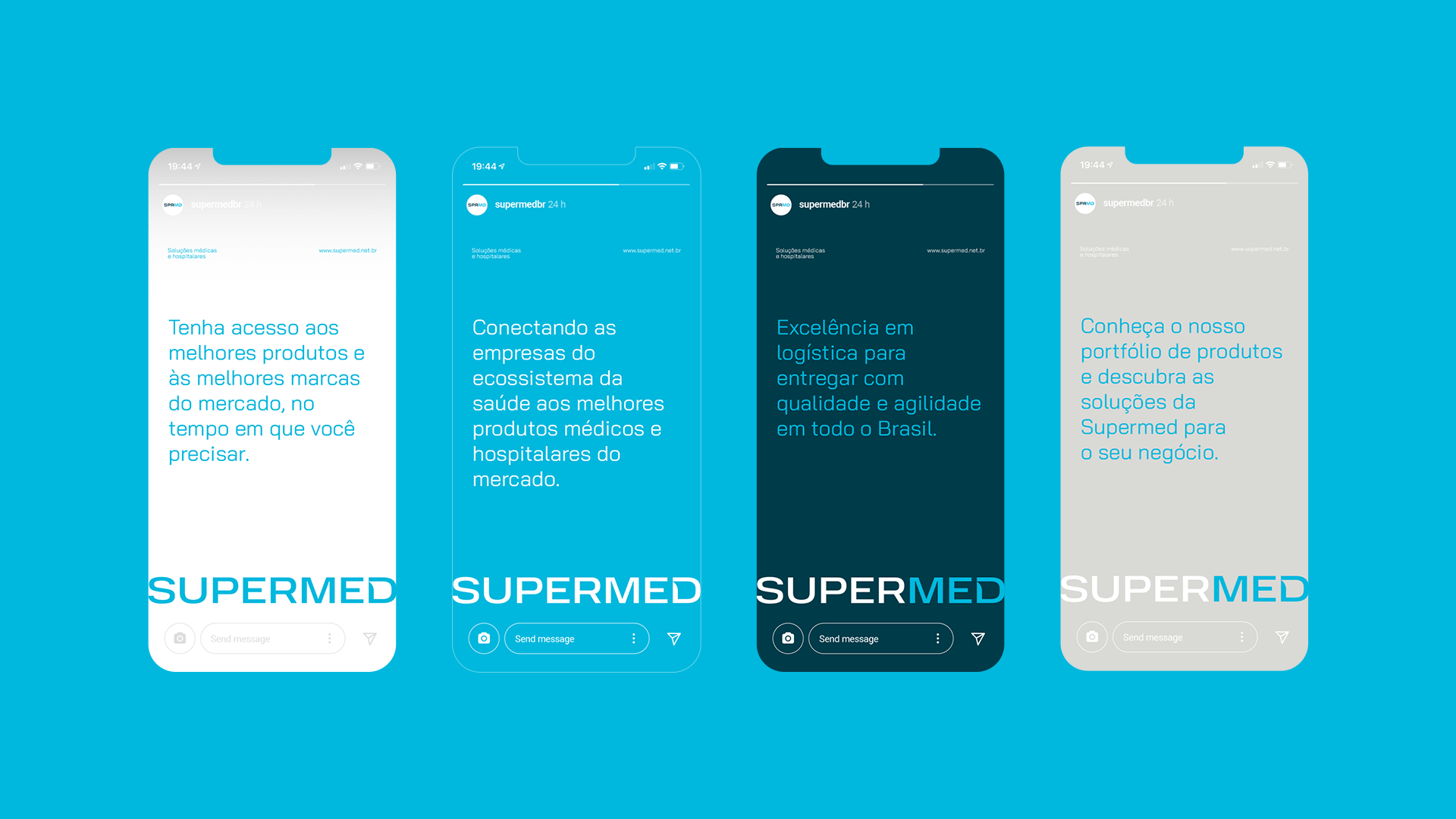
We translated these concepts into a visual language full of movement and synergism, with a (super)expressive and (super)kinetic typography, thus creating a living, pulsating, current brand prepared for the challenges of the future.
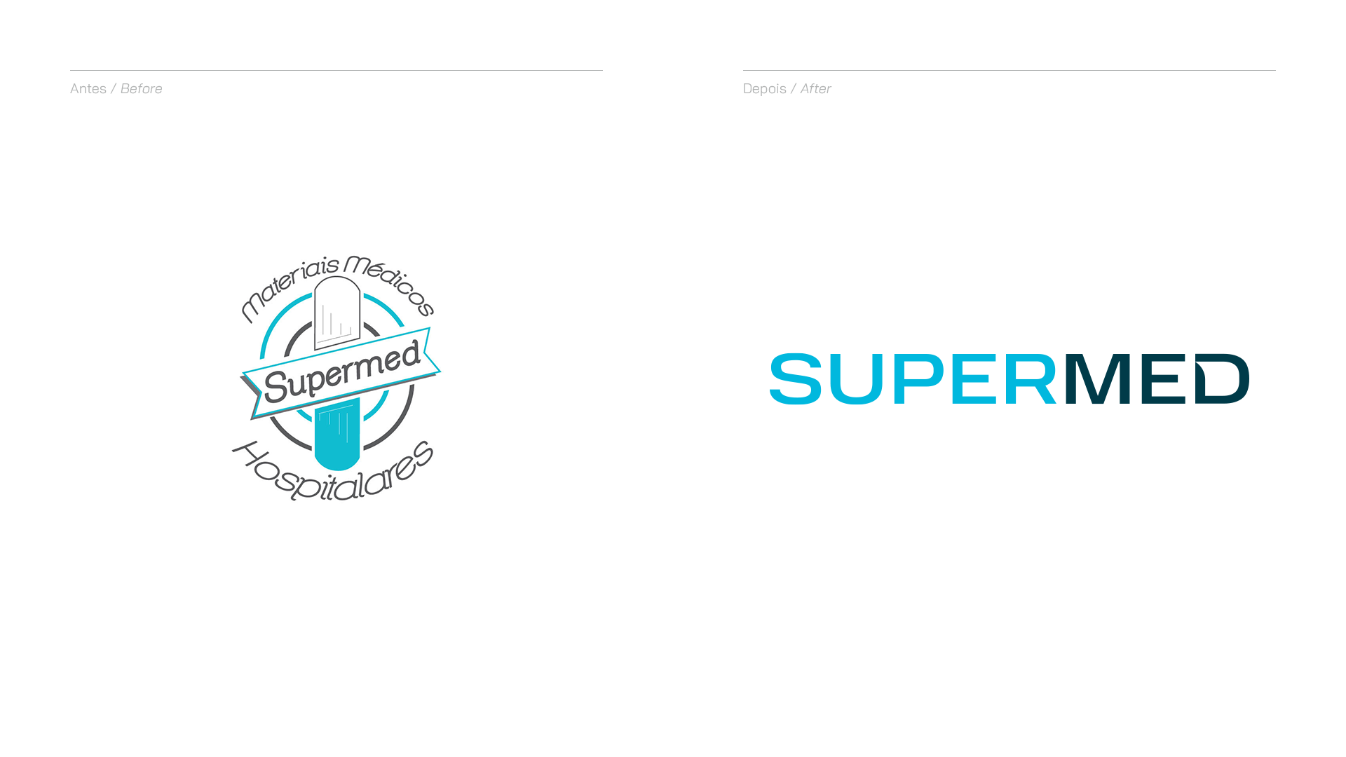
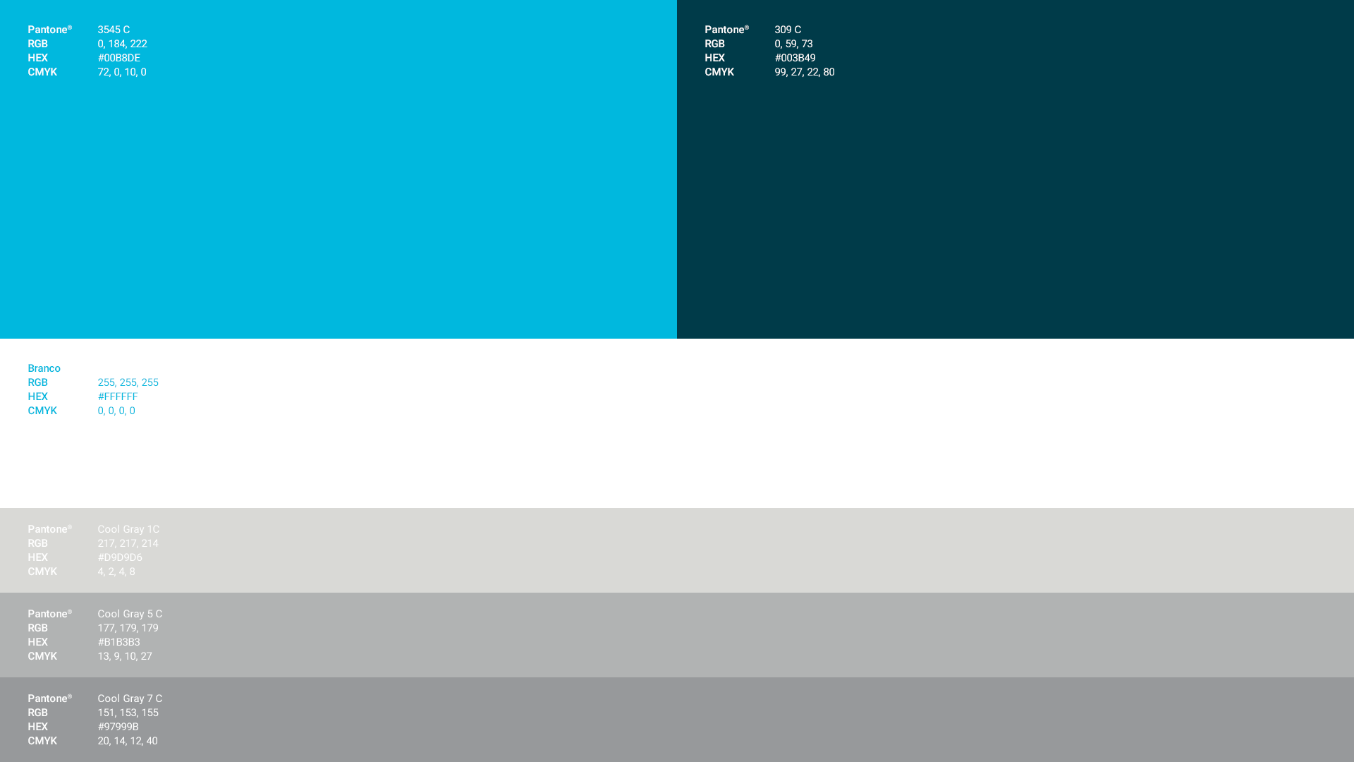
We preserved cyan as the main color of the brand, showing that in this moment of evolution the brand still maintains its essence, and we added a darker tone of petroleum blue to its color palette, generating greater contrast between the colors and signaling the company's maturation to the over time.

Branding Agency John and Hackmann Co.
Art Direction João Hack.
Design André Santos.
Strategy Fabio Turkienicz & Júlia Bertaso.
Motion Emanuel Peres.
Artwork Nicolas Friebel & Gabriel Alves.
Management Nicolas Friebel & André Trois.
Sales Caio Costa.
All rights reserved.