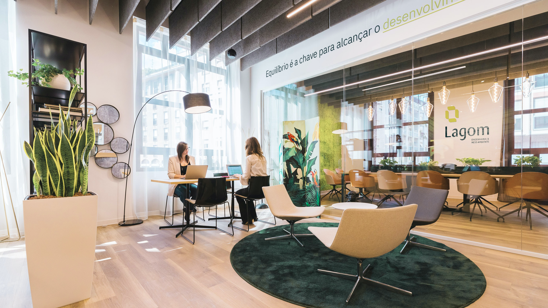
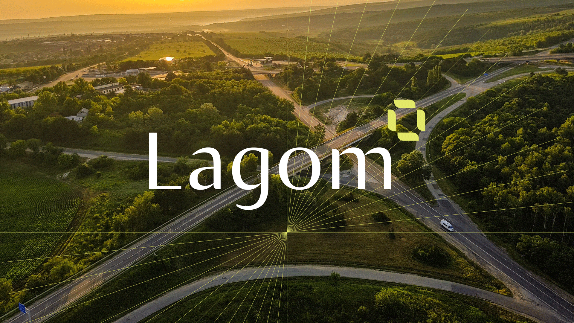
Lagom Environmental Engineering
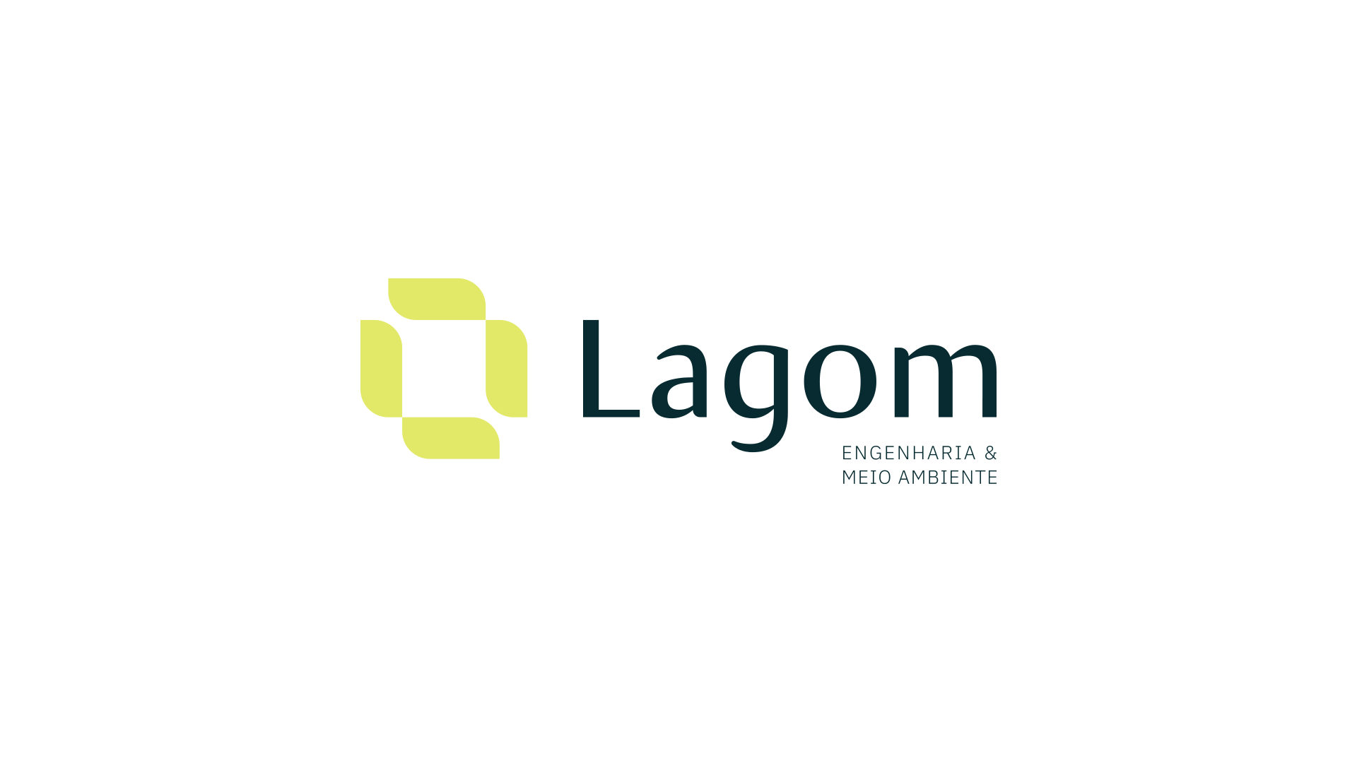
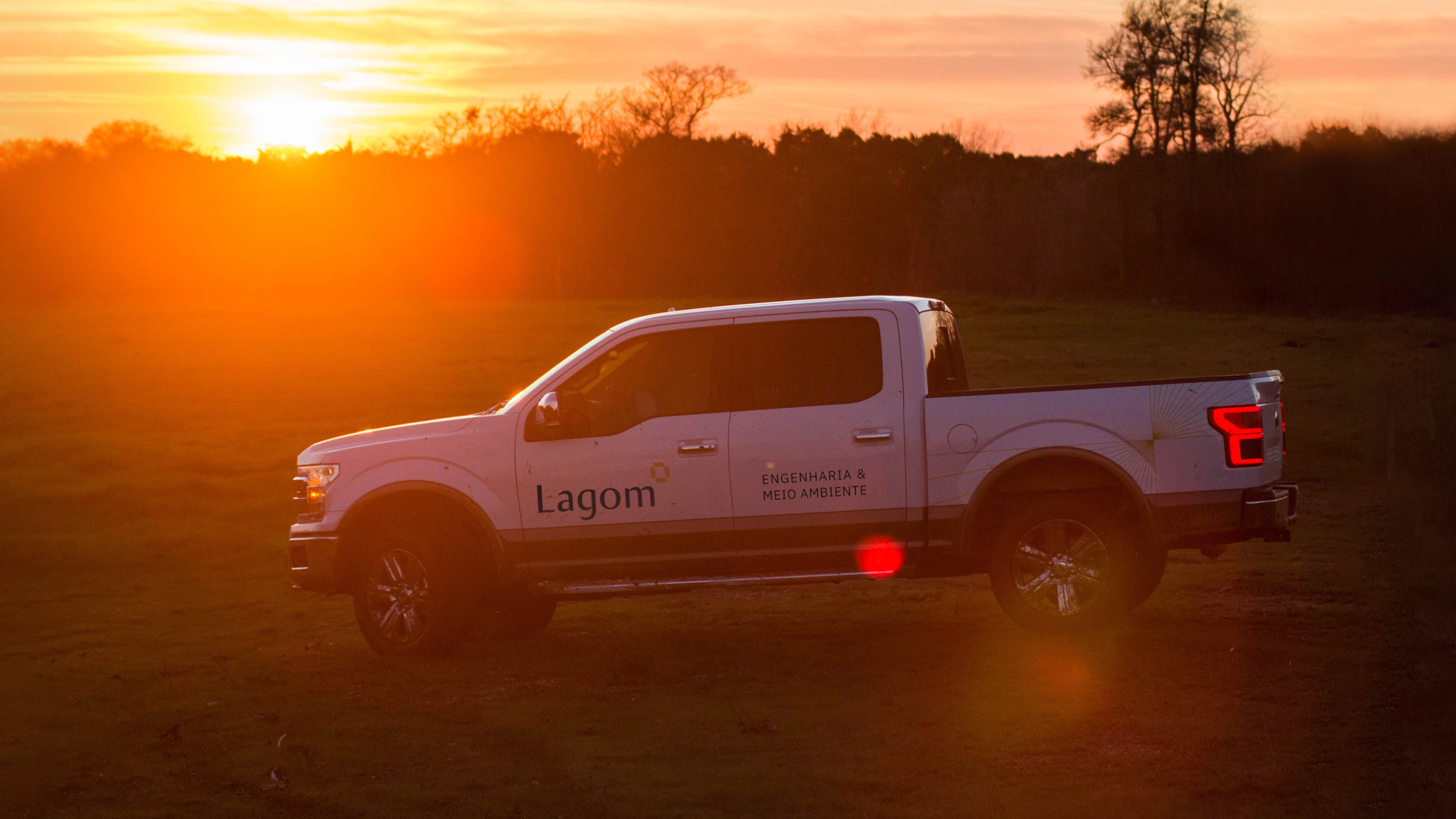
Client: Lagom Engenharia e Meio Ambiente
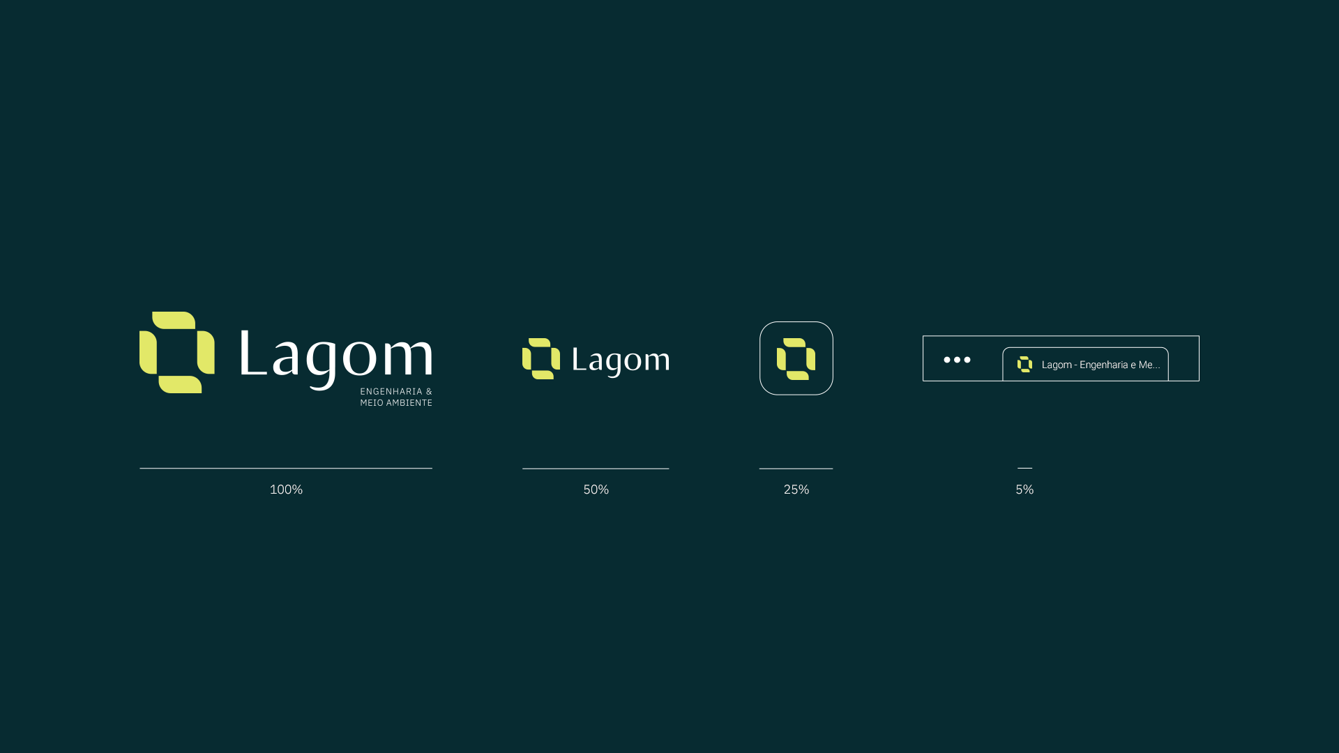
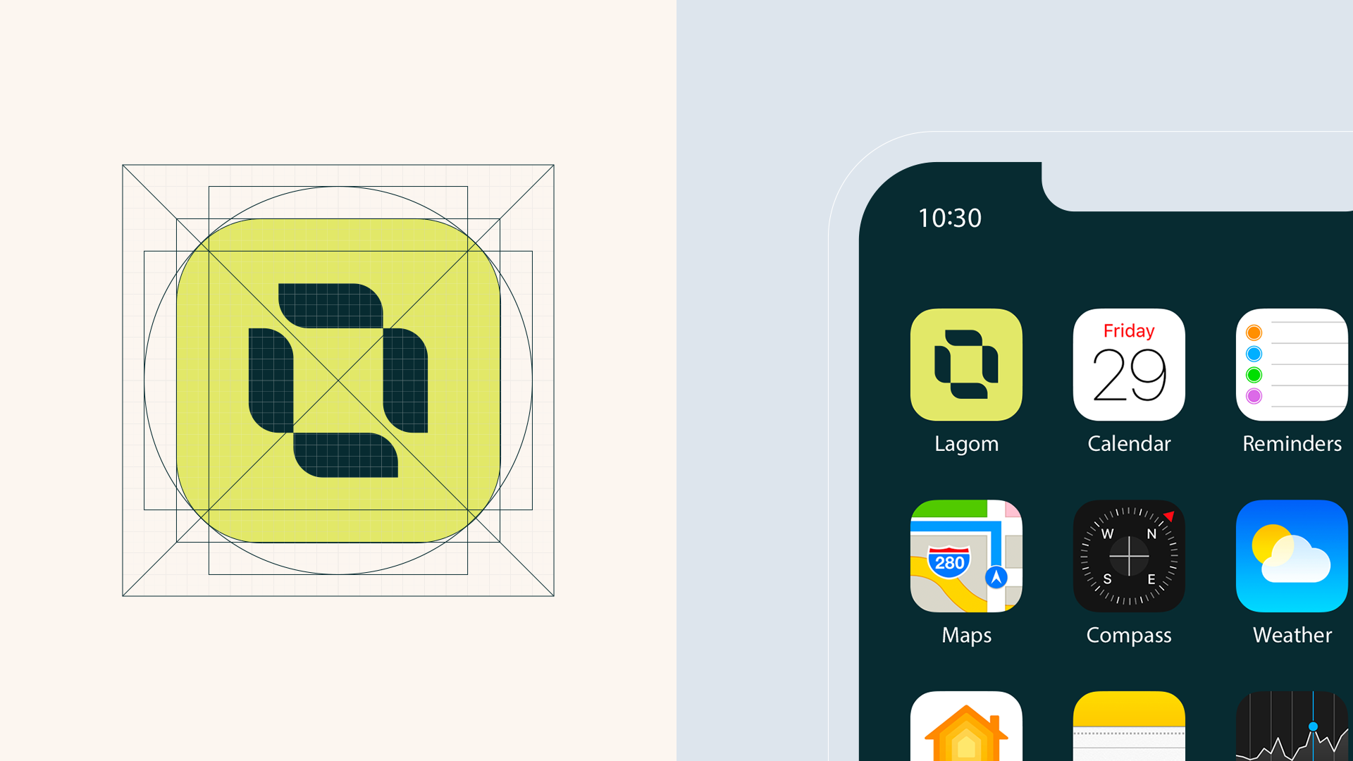
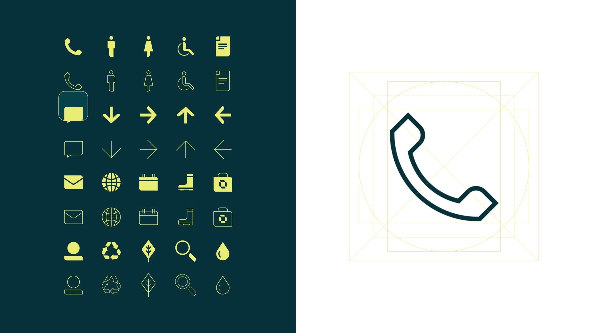
Project: Brand strategy and positioning; naming; brand identity; iconography and website layout.
Location: Santa Catarina, Brazil.
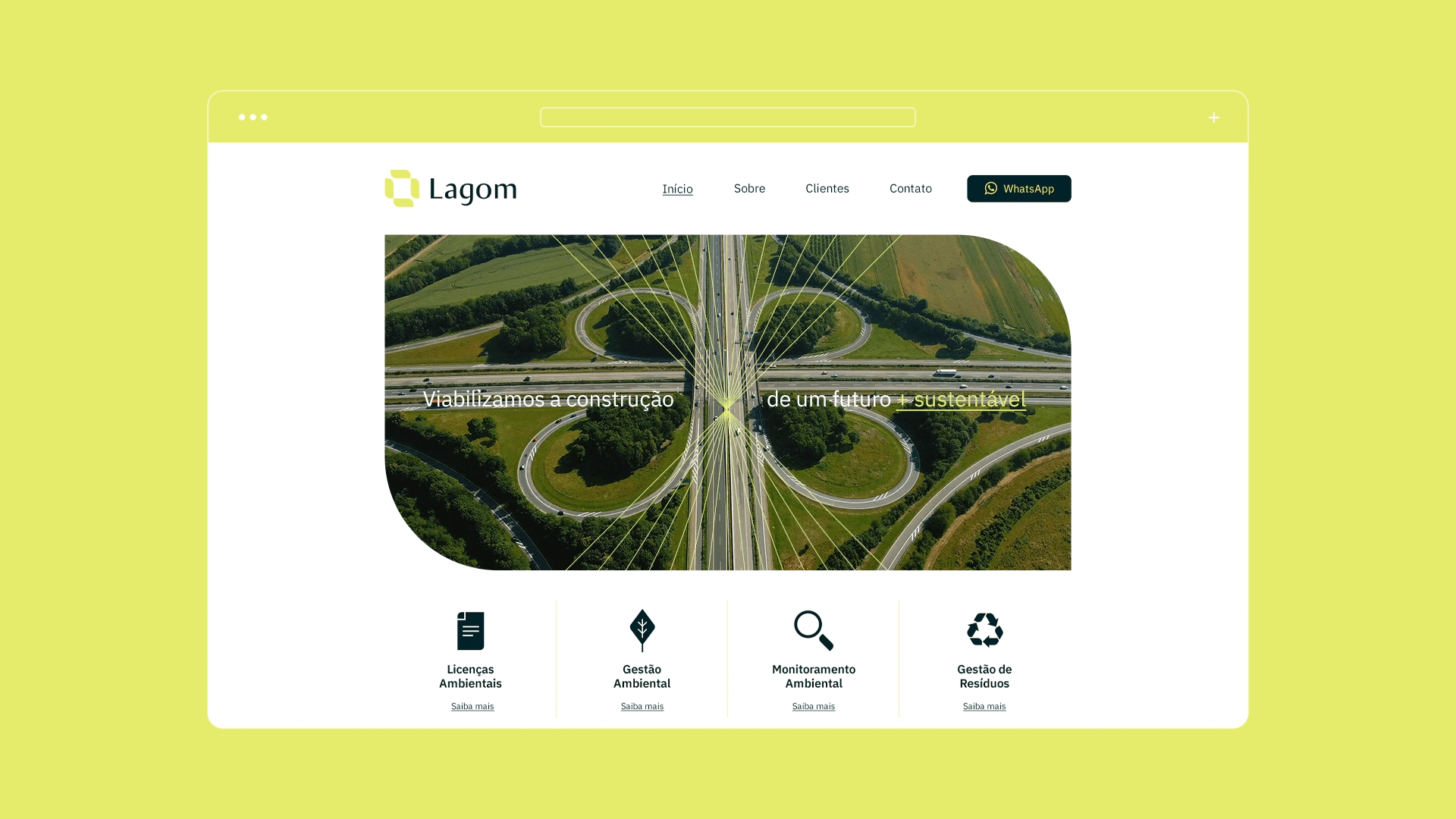
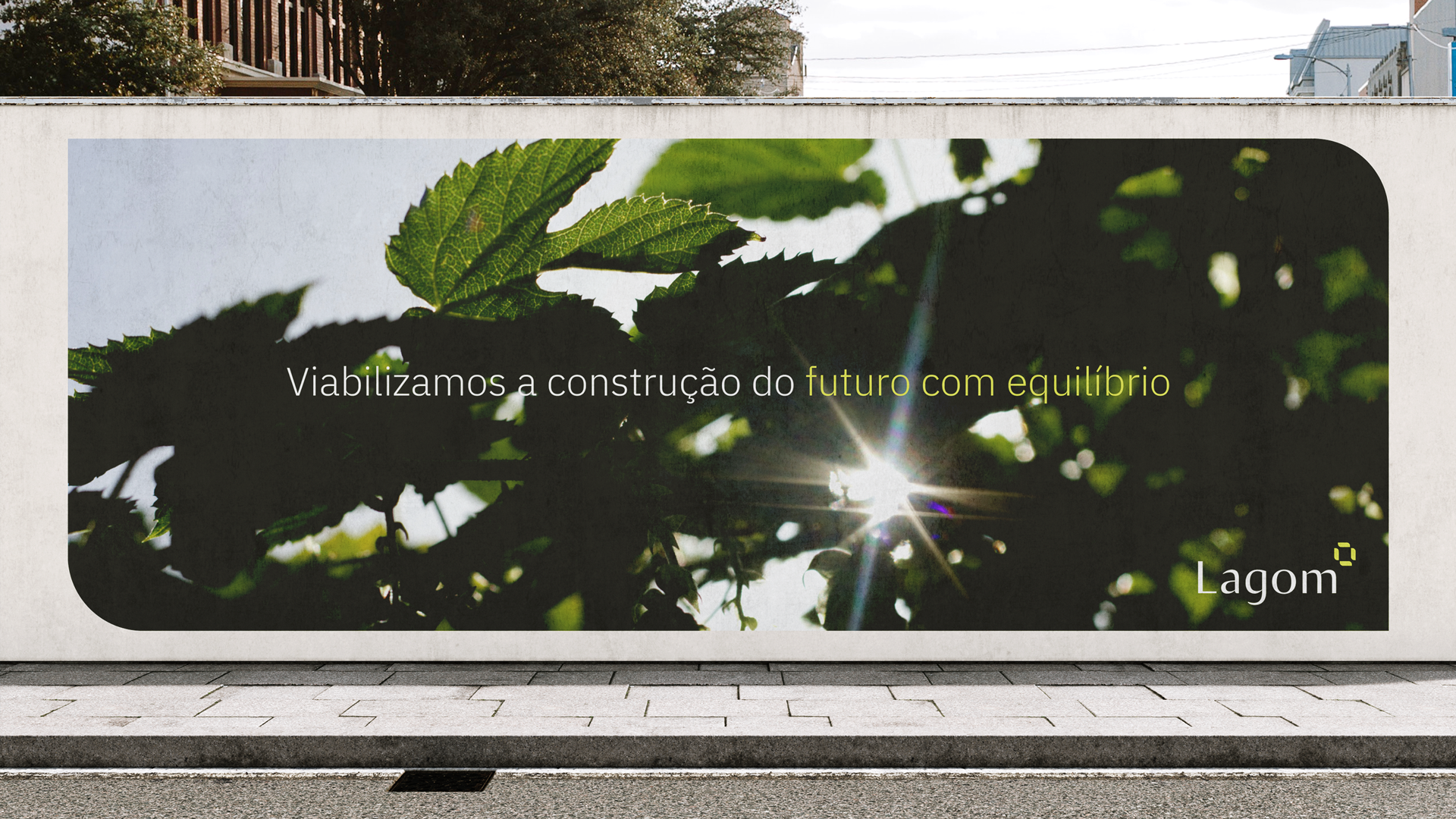
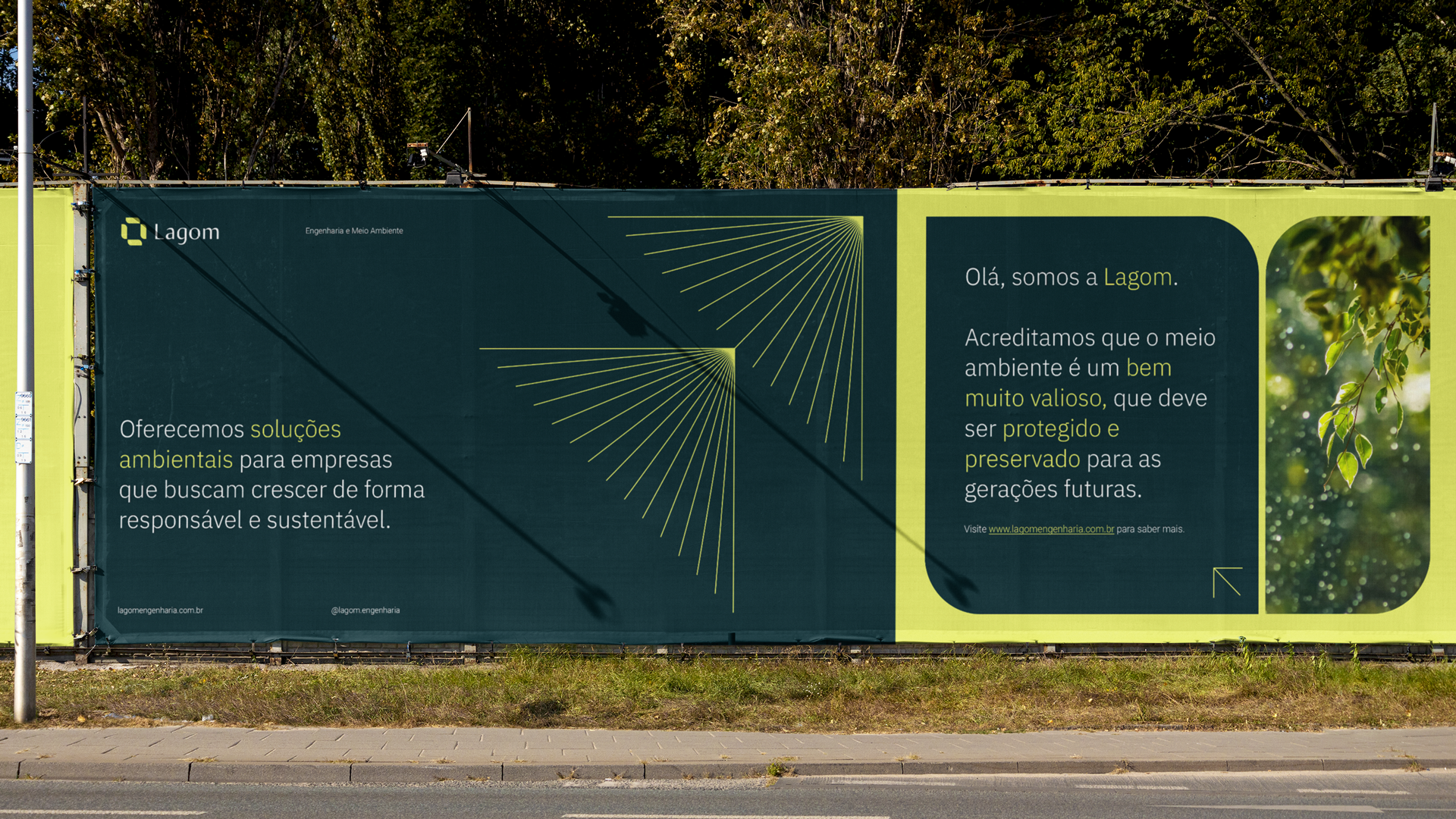
Lagom Engenharia e Meio Ambiente is an environmental consultancy that offers solutions for companies that want to grow and develop their projects in a responsible and balanced way, enabling a more sustainable future.
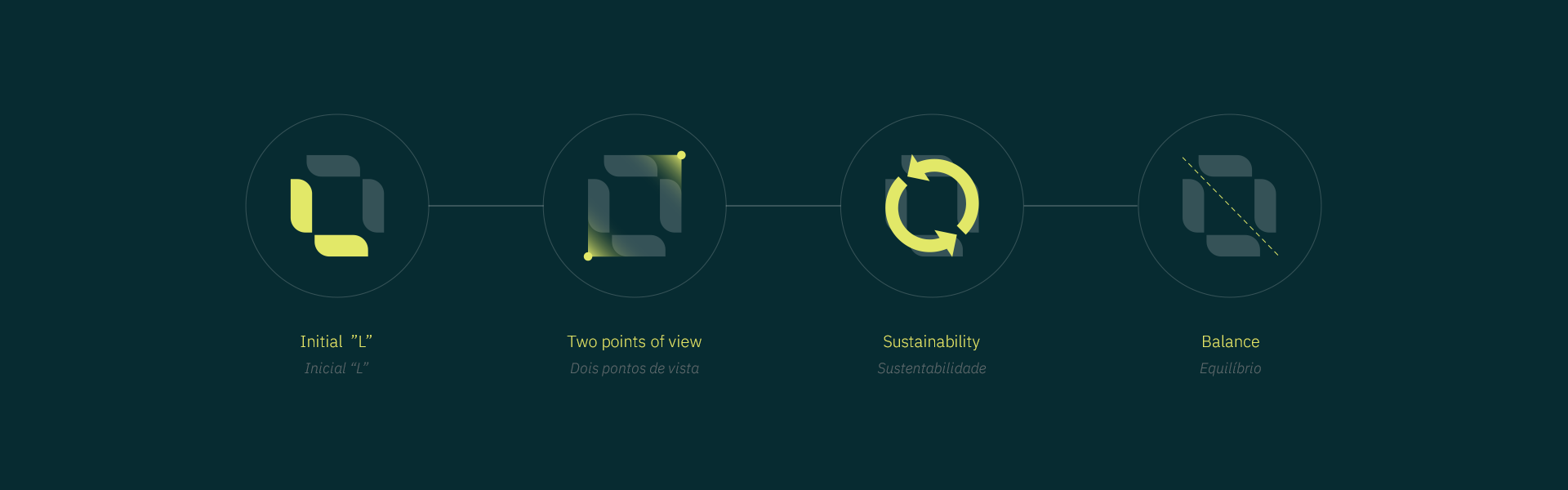
The word Lagom, the name with which the brand was baptized, is a Swedish expression without an exact and literal translation into Portuguese, but it has a very strong meaning and is completely aligned with the purpose of the brand. Lagom carries the meanings of “in the ideal quantity, in the right measure, adequate, enough”, that is, it is an expression that represents a lifestyle where balance is proposed as the key to the proper functioning of all things in life.
CHALLENGE
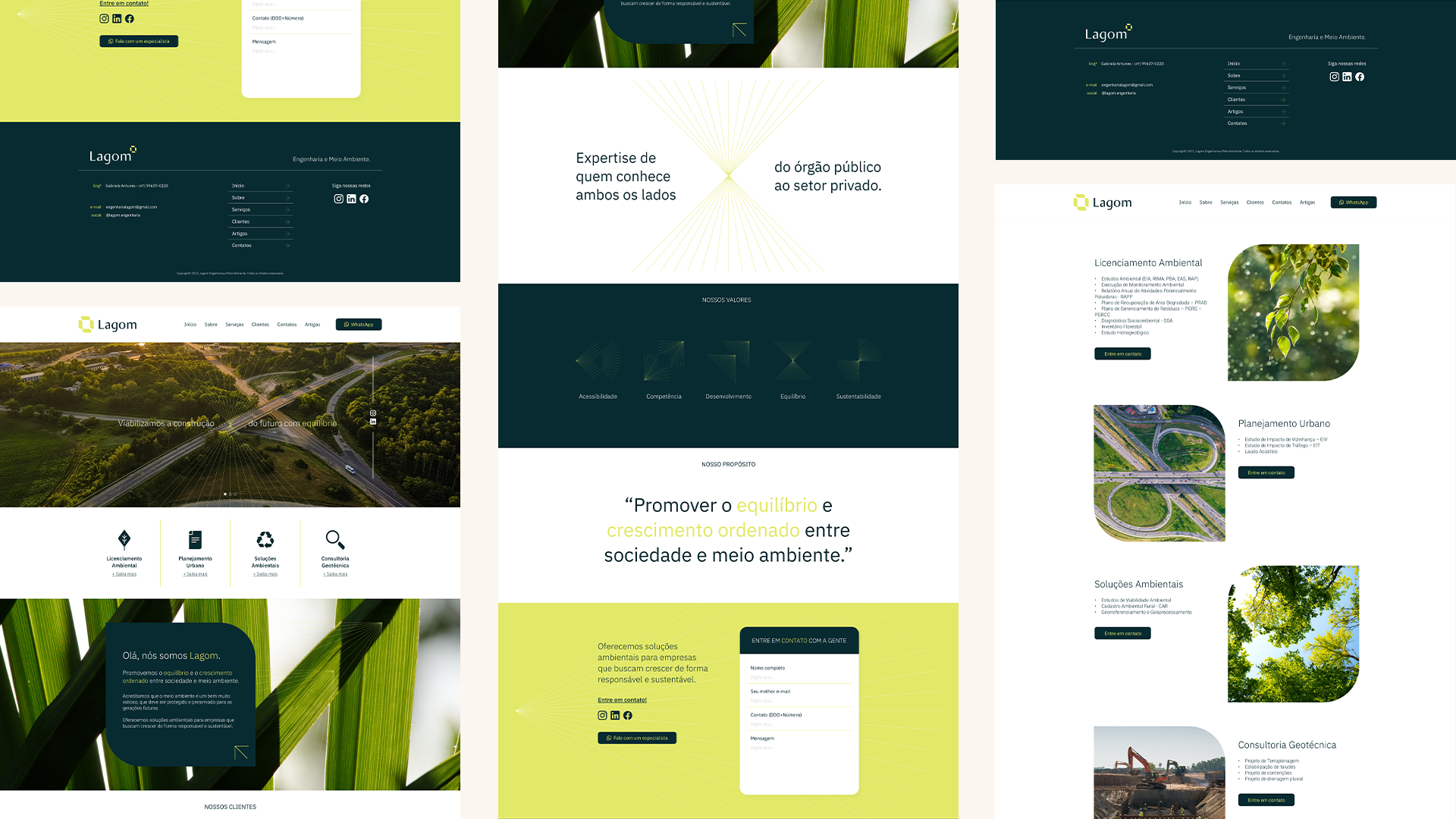
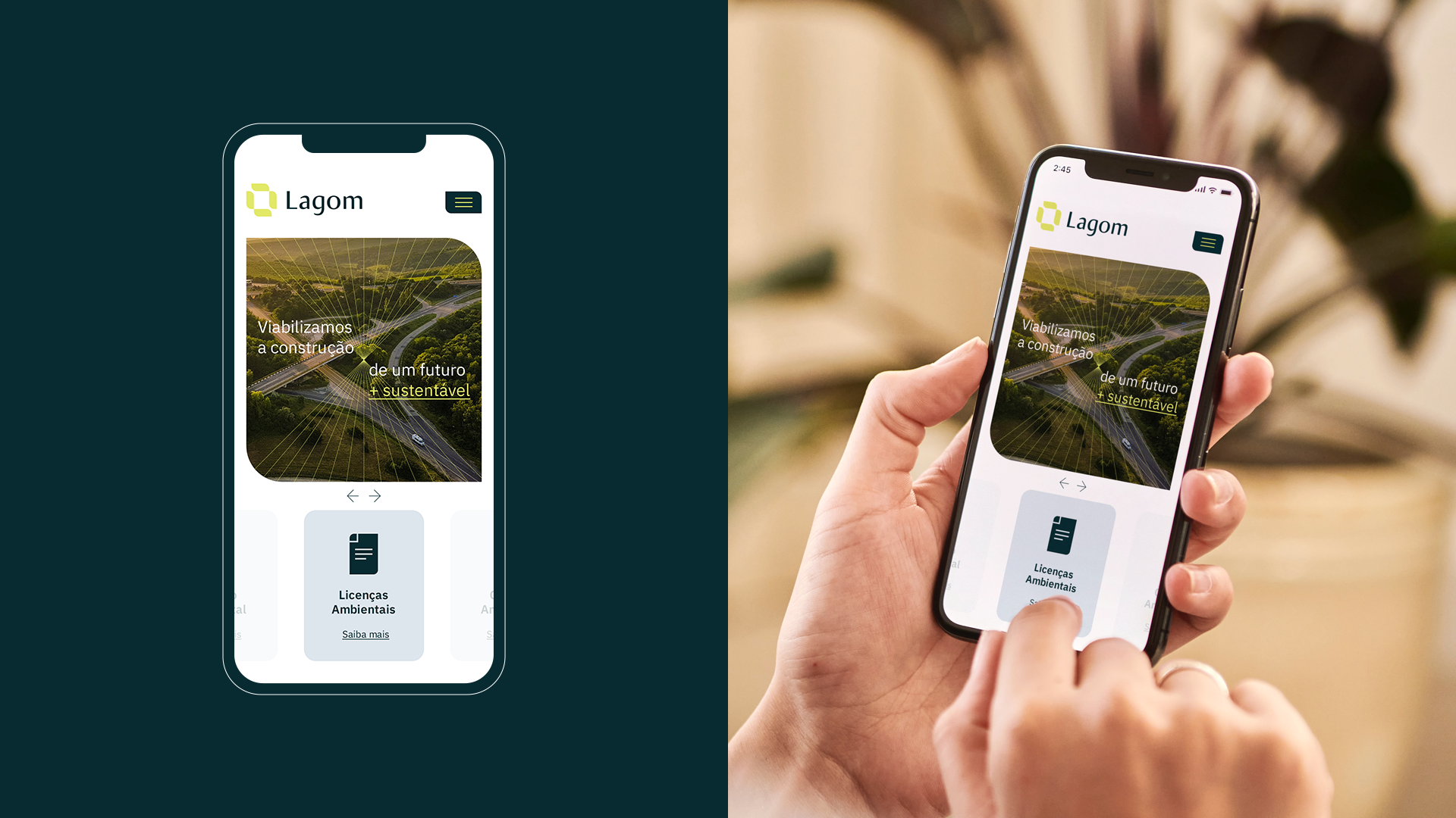
The project was developed in collaboration with Lagom's leaders, understanding the needs and strategic directions intended for the business. The main objective was to provide the business with access to its desired customer profile, that is, medium and large companies in the local civil construction sector, having a proprietary visual communication that would support this contact and connection.
SOLUTION
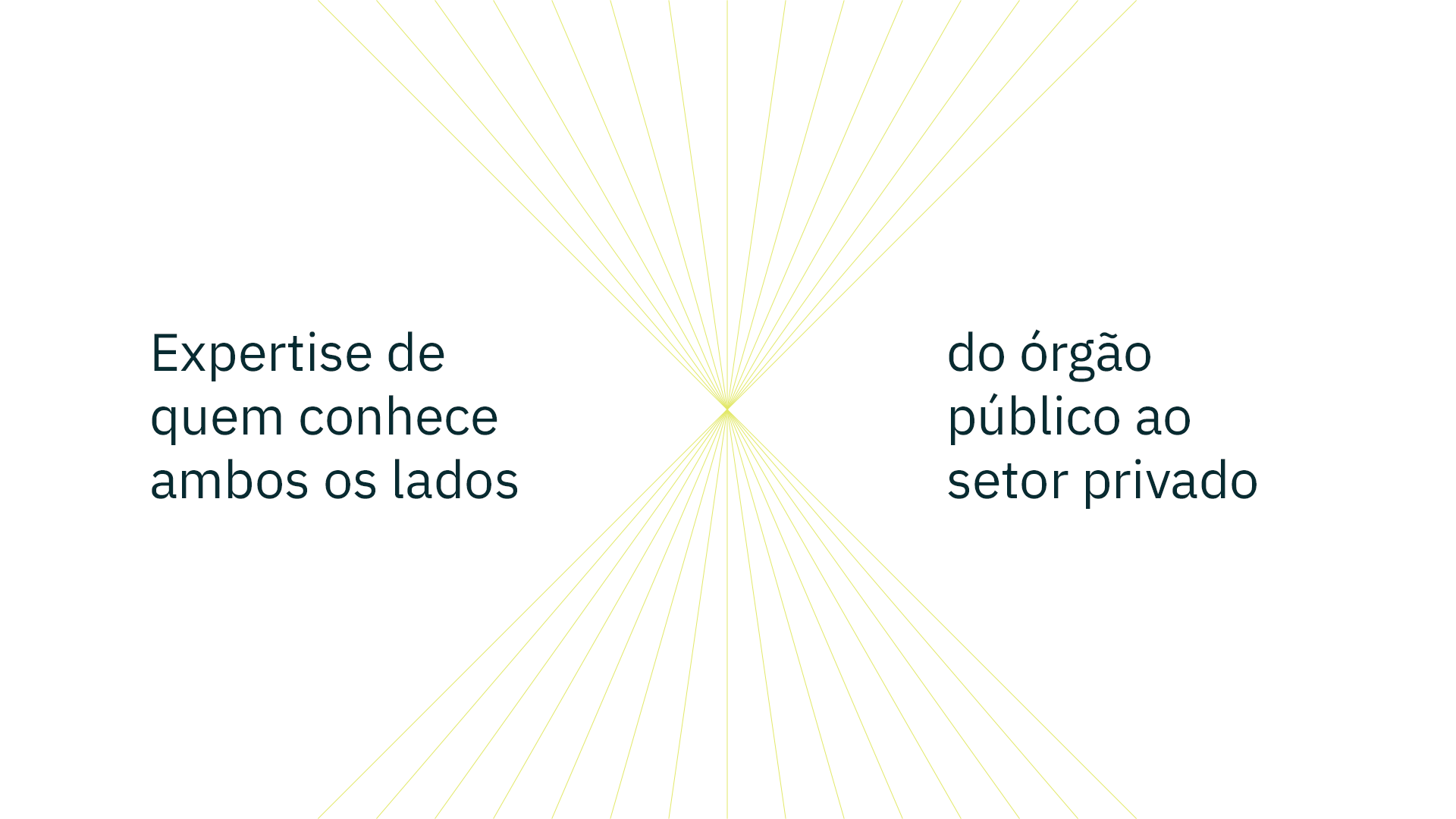
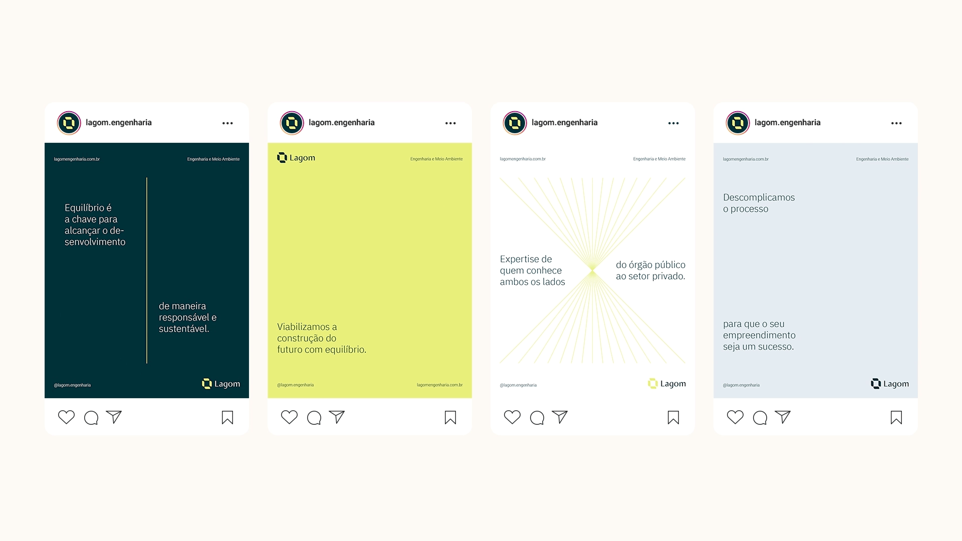
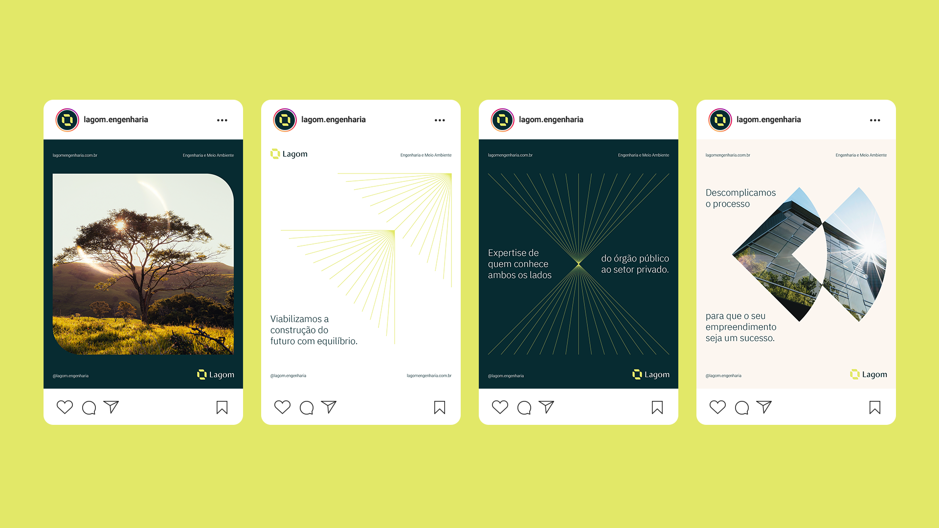
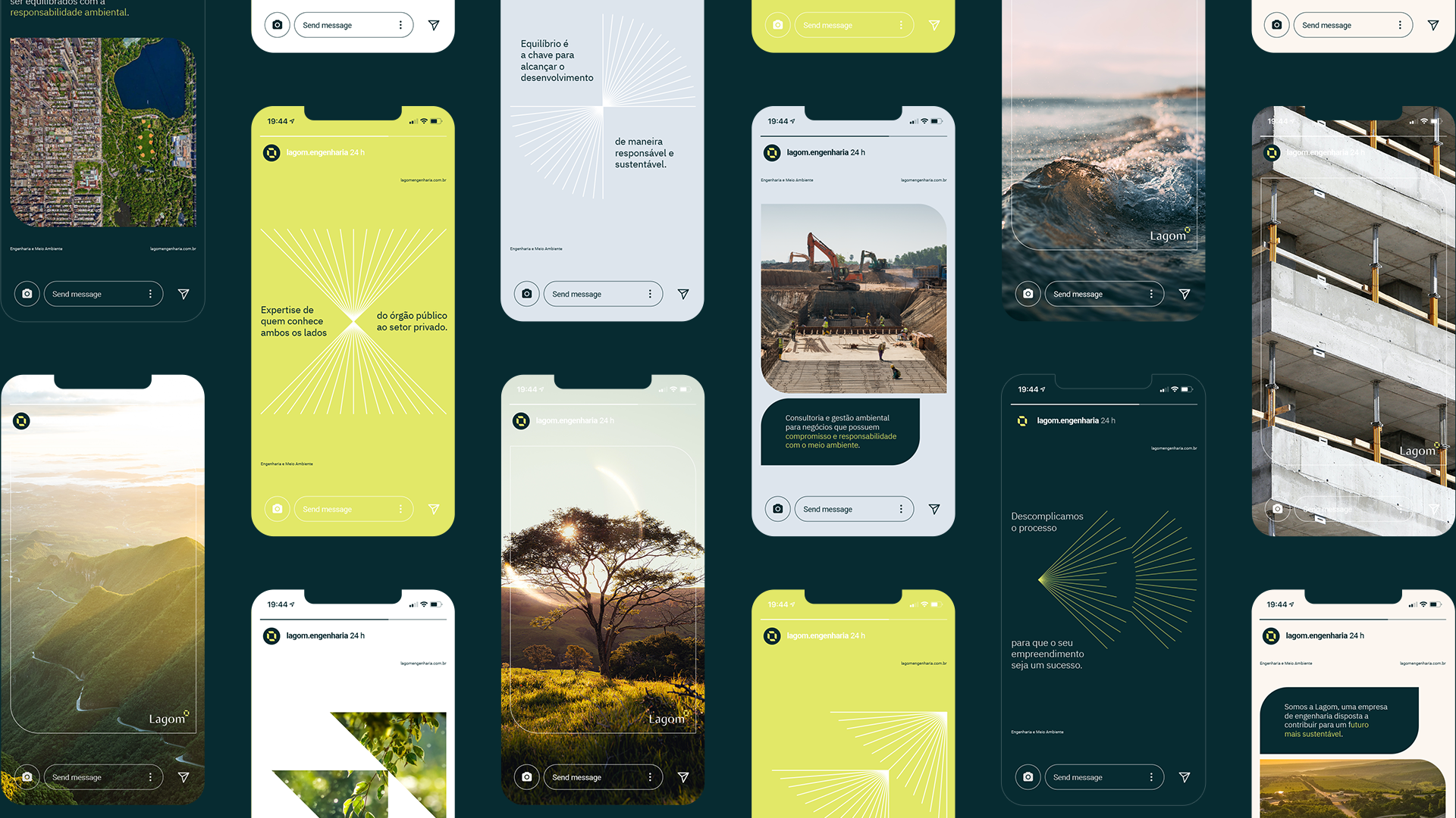
The initial starting point was to graphically explore the competitive edge of the business: the vision and know-how of its leadership, who has already worked on both sides of the sector, from the public agency to the private sphere, and therefore knows the ways to make bureaucratic processes into agile and efficient.
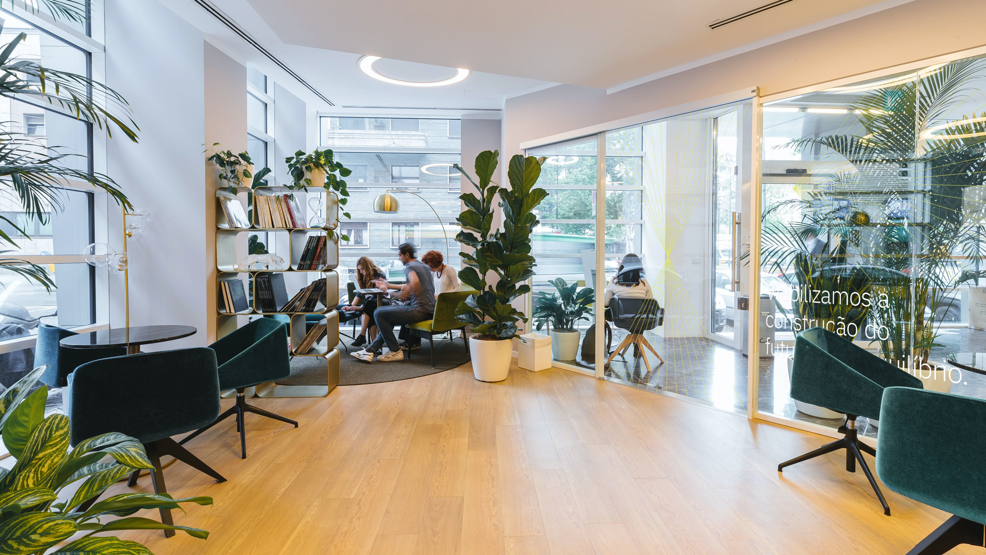
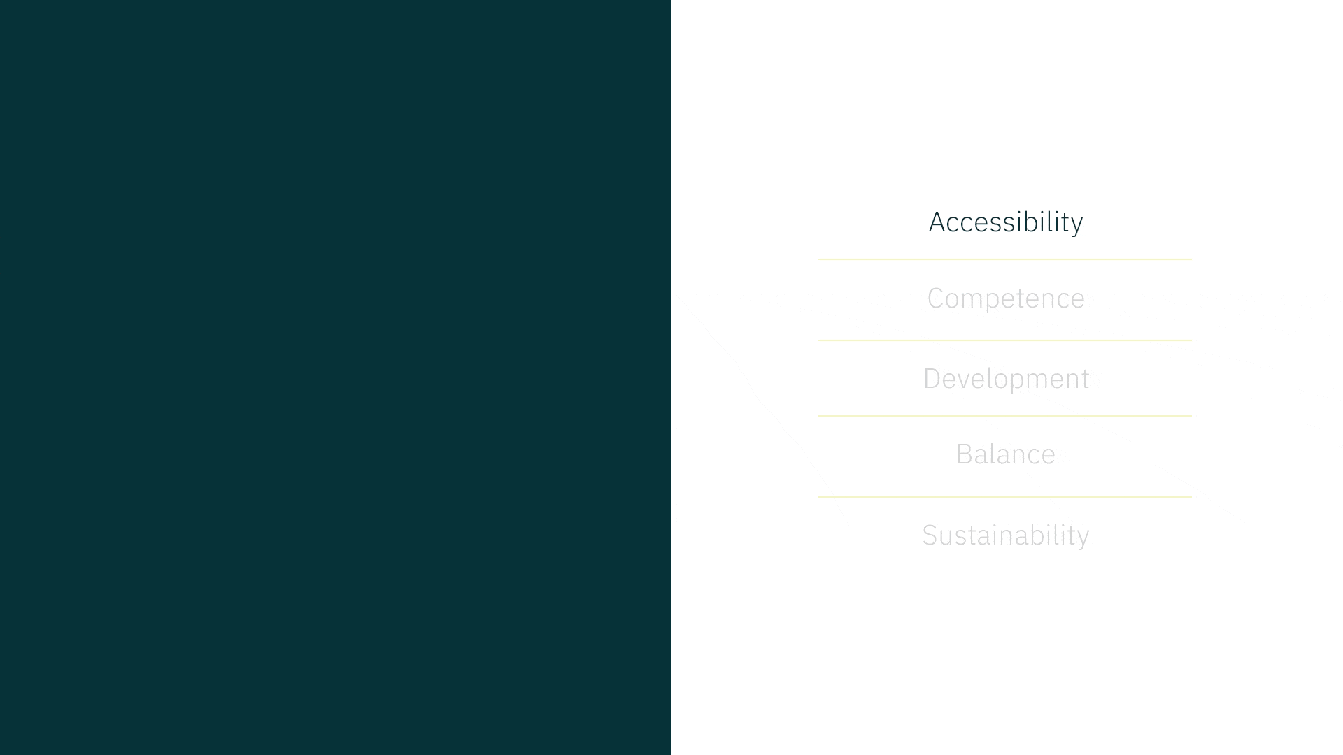
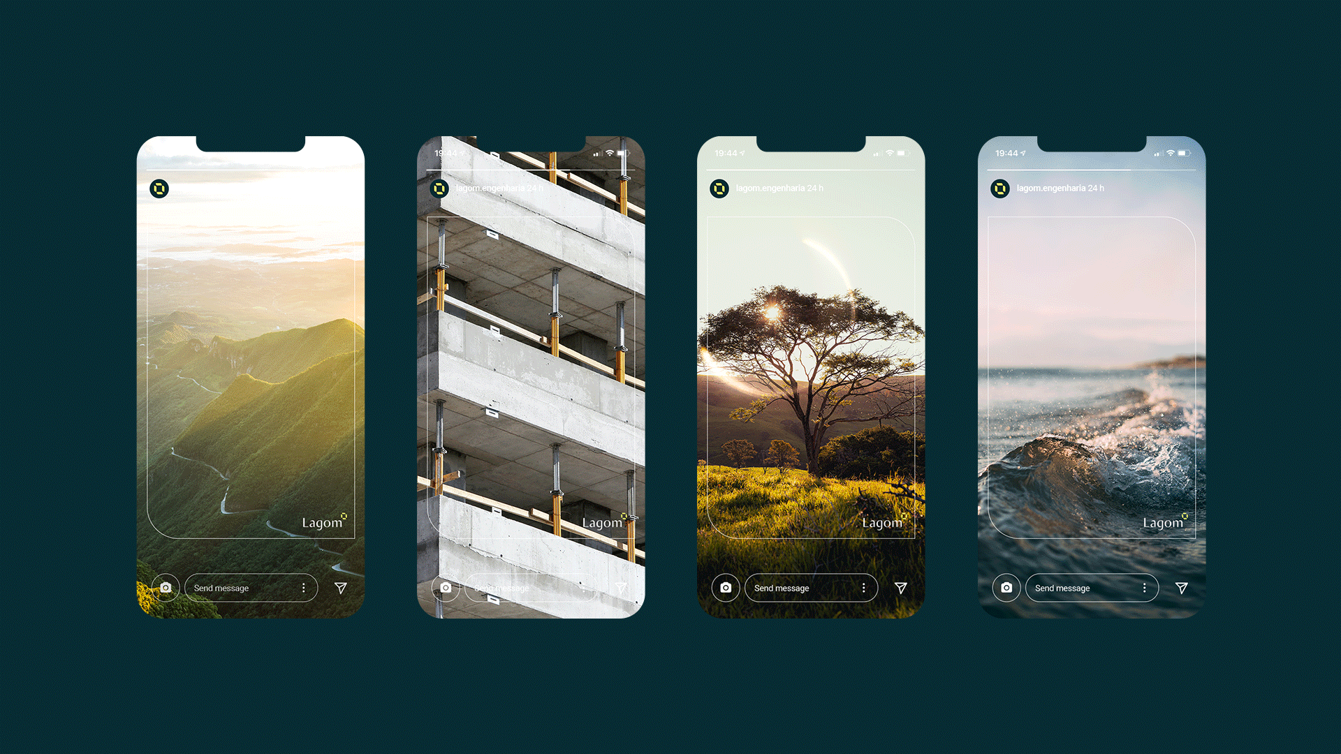
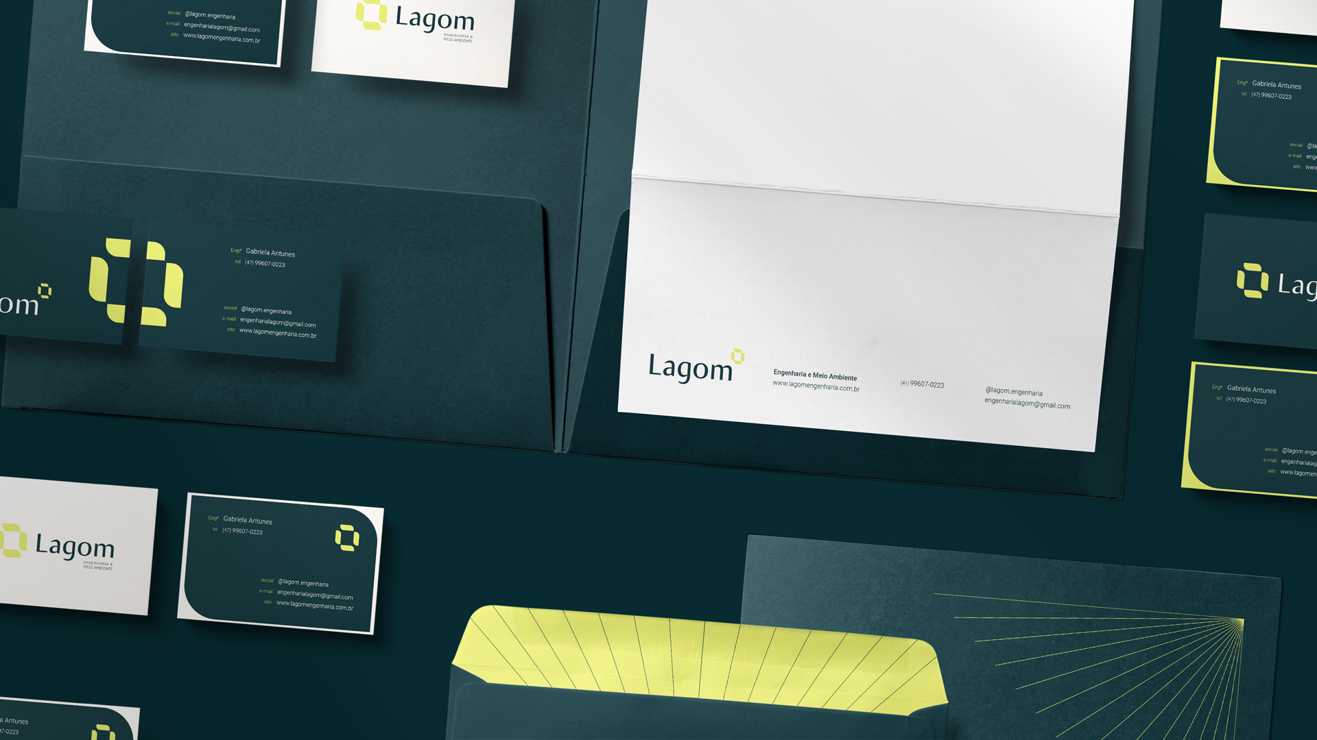
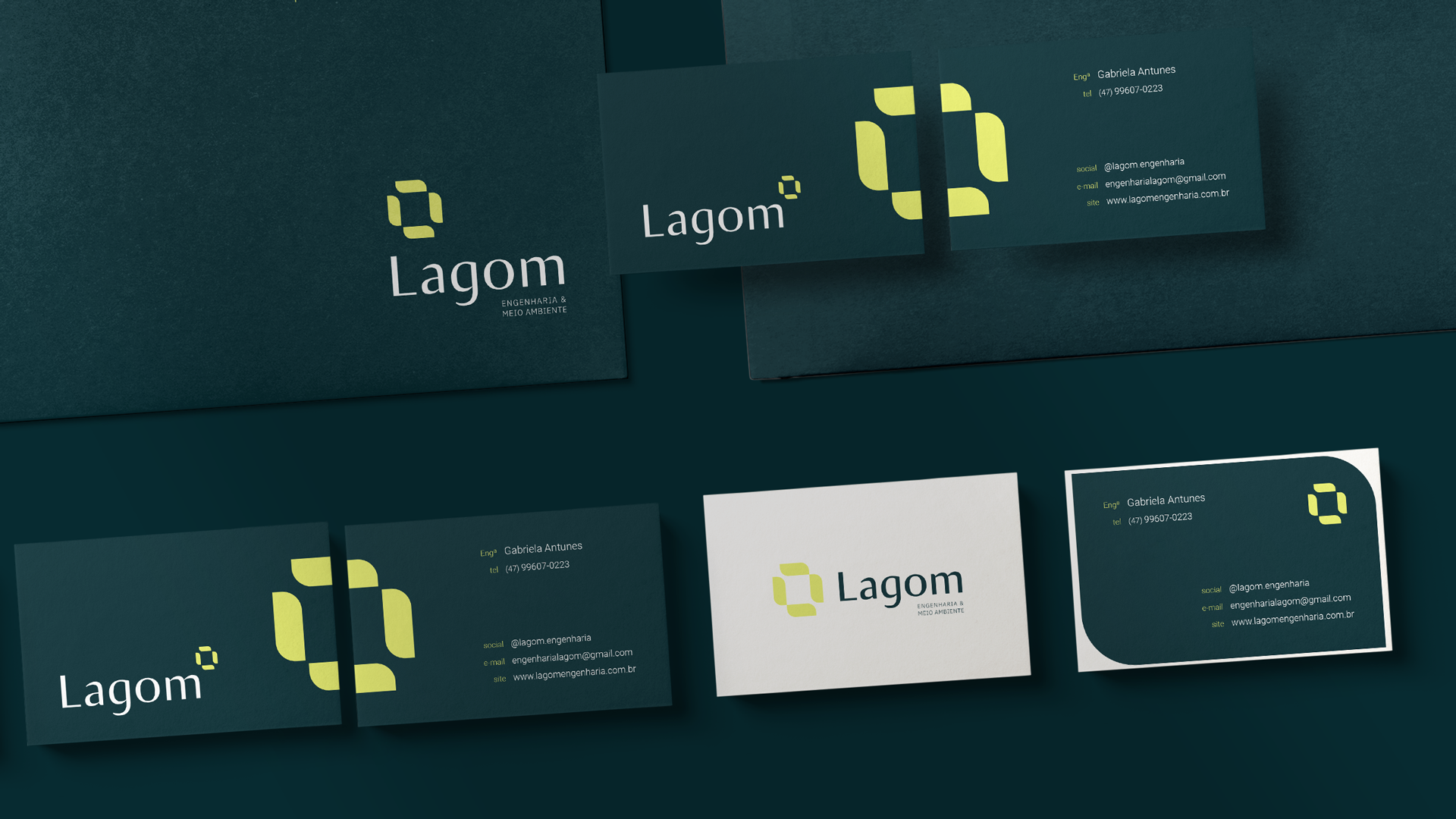
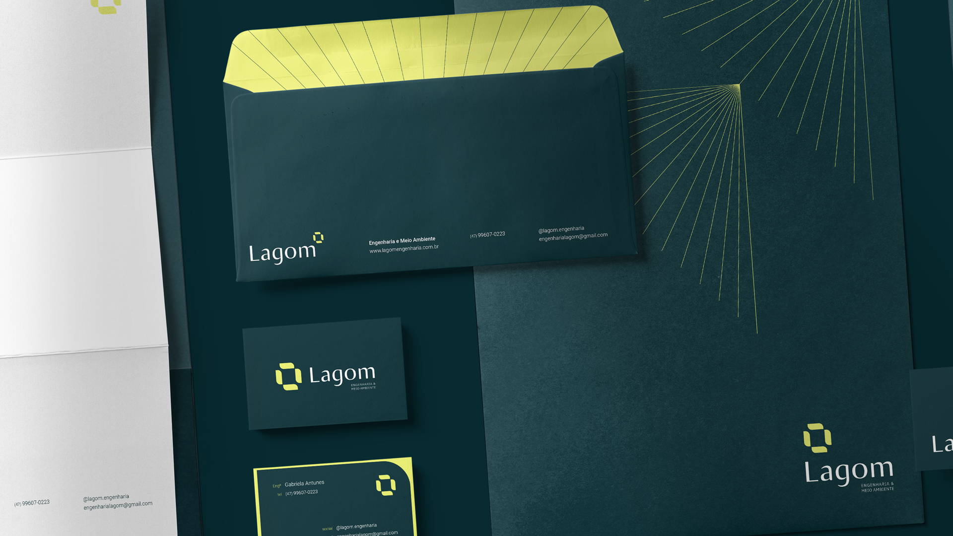
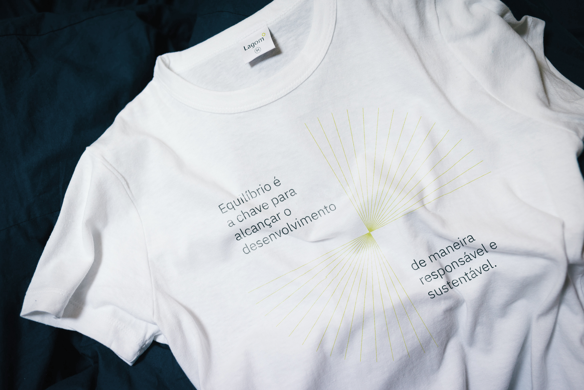
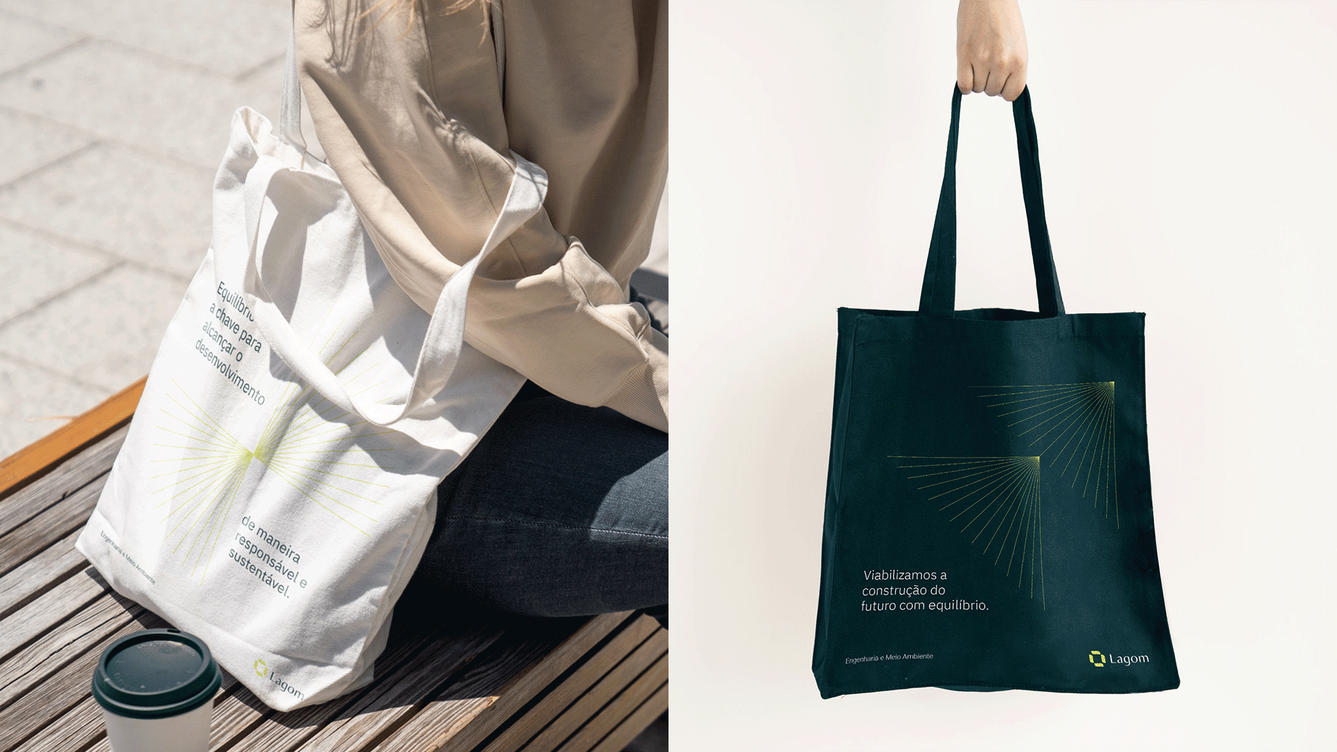
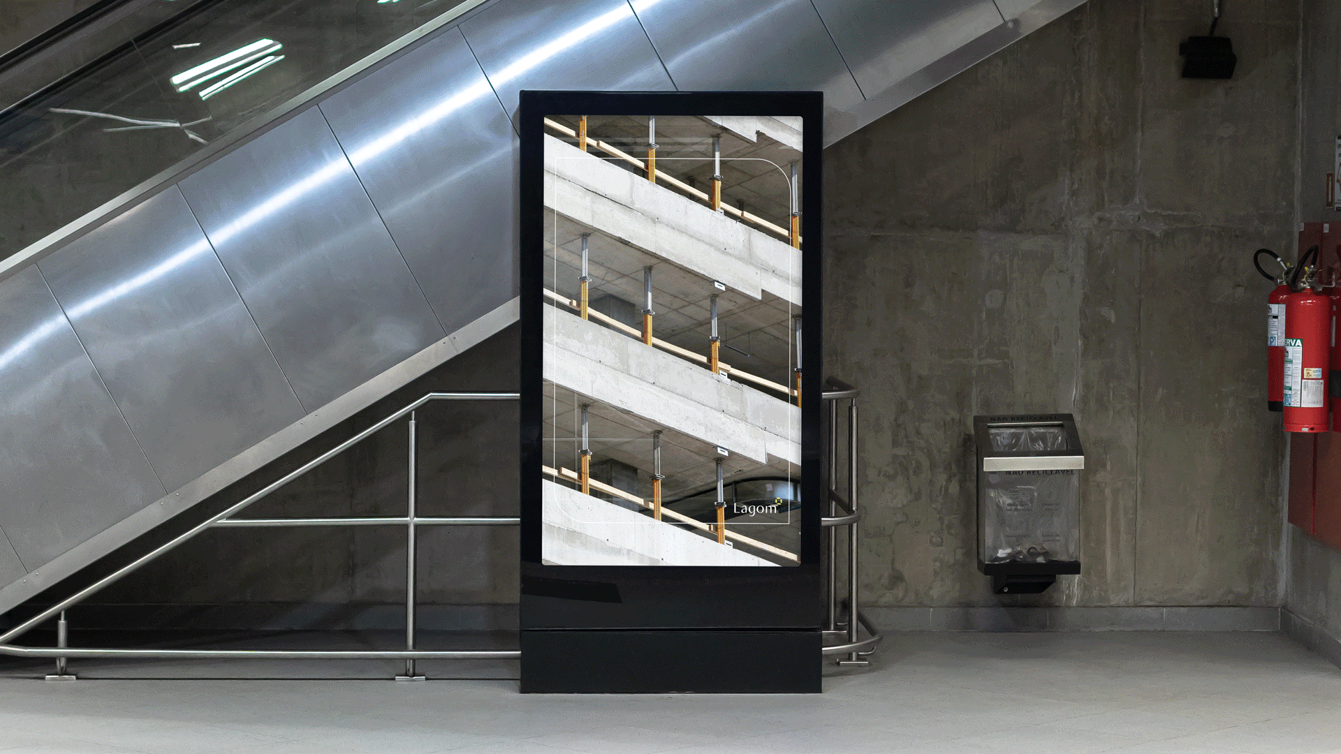
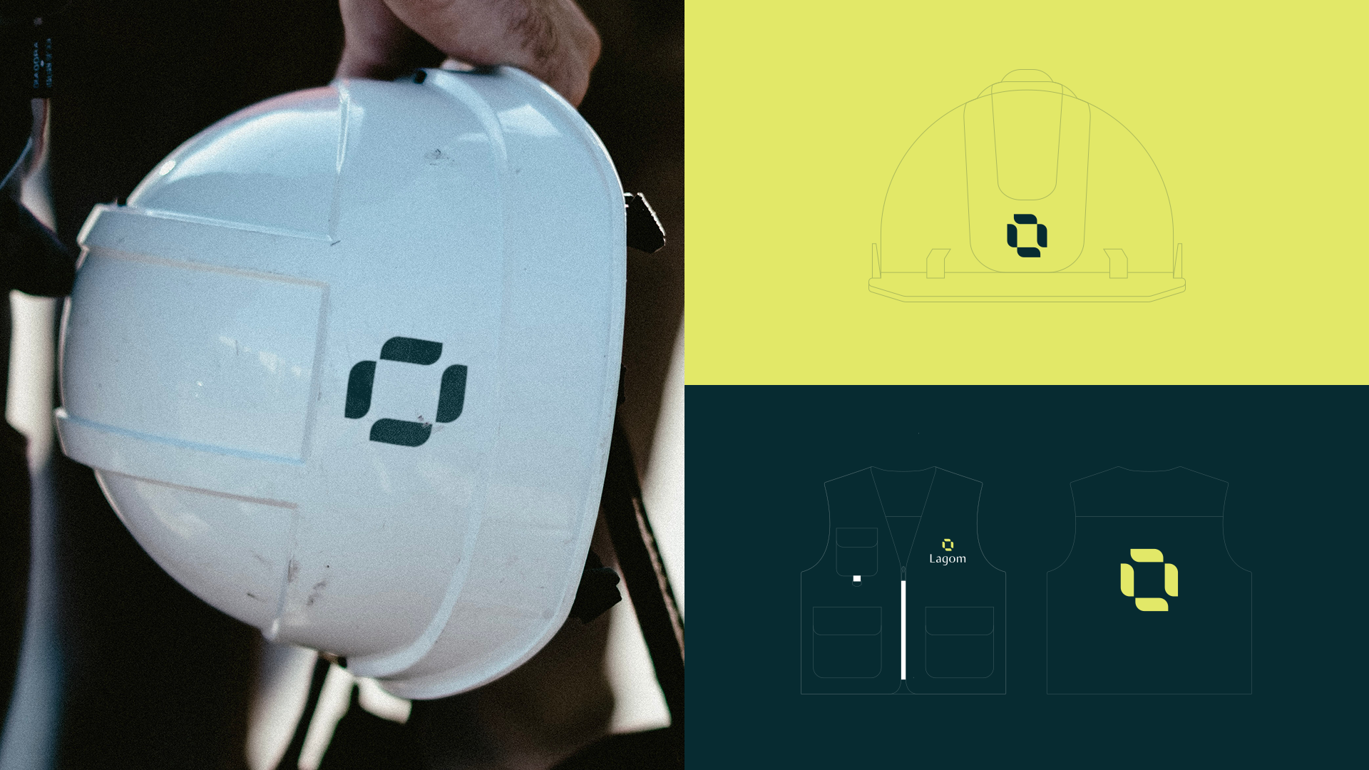
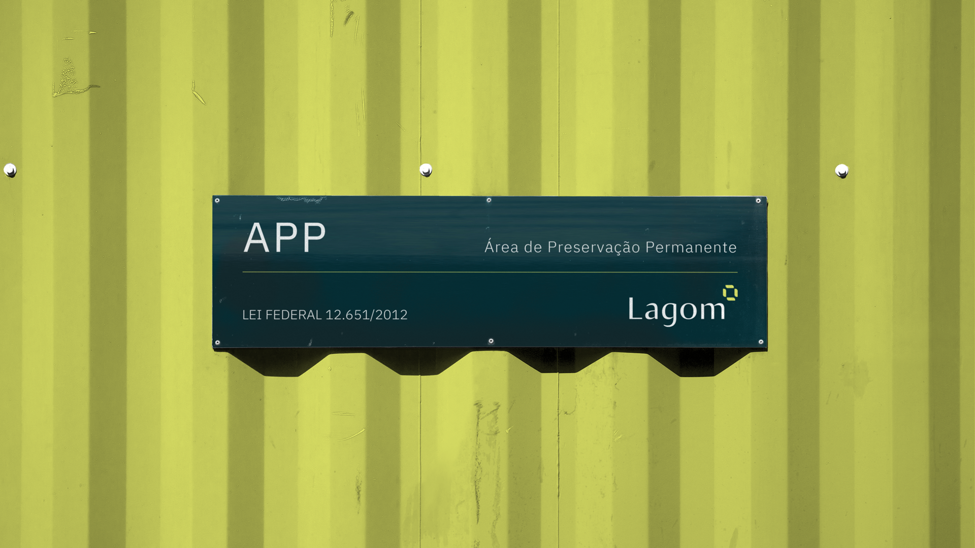
This look from both sides was translated into a visual universe that reflected the concepts of duality and balance, aligned with the narrative of the brand that works towards development in a responsible and balanced way. This duality is presented through shapes that have rounded corners (organic) contrasting with right-angled corners (precision), representing this combination of engineering and environment.
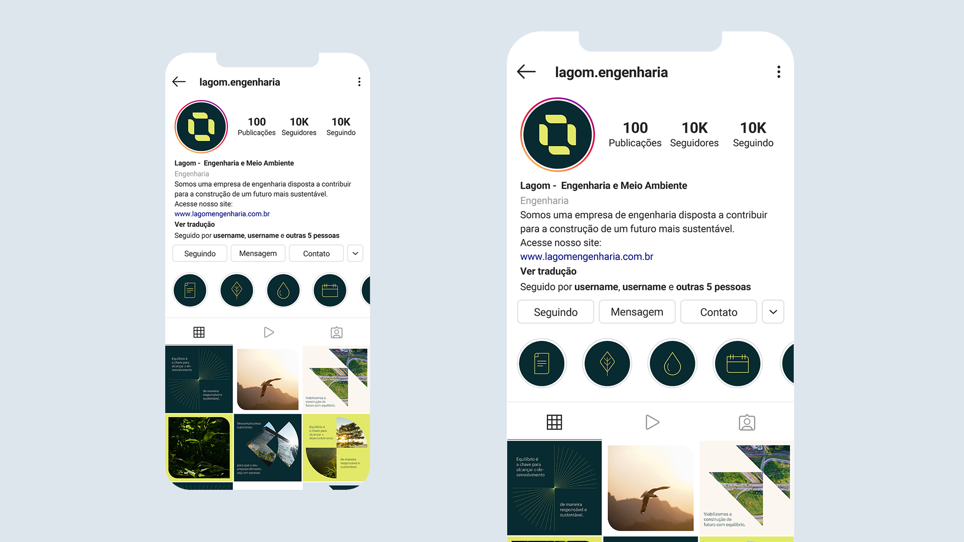
In addition, each of the company's organizational values has become a graphic element that integrates the brand's visual language and expands its possibilities of use and application.


Brand Strategy, Naming & Design André Santos.
Motion Design Emanuel Peres.